Therabath

- Art Direction
- Brand Identity
- Logo
- Messaging
- Packaging
- Print Collateral
- Website Design
Therabath
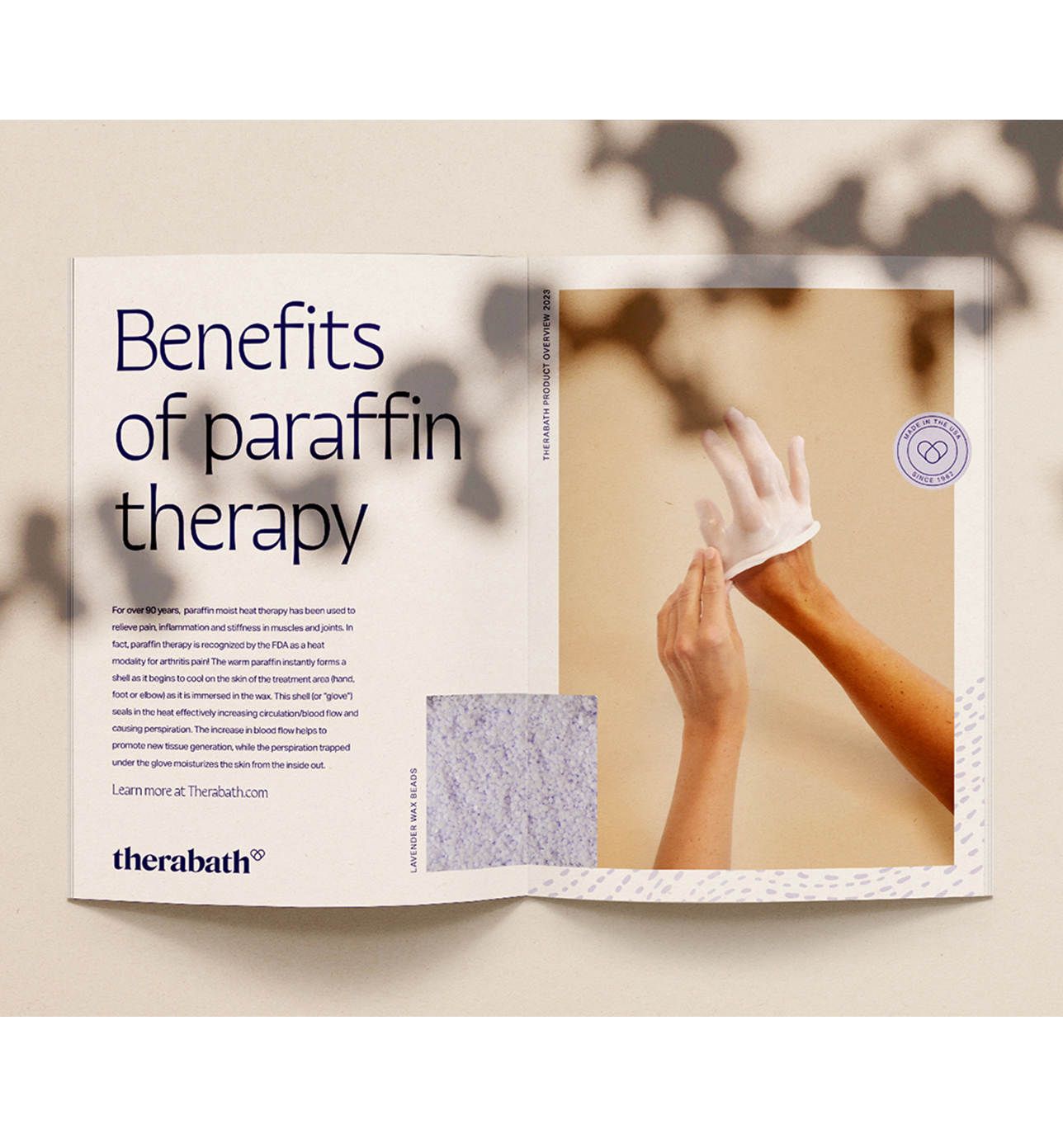
Therabath came to us seeking a rebrand to help align its visuals more closely with their expanding consumer-centric audience. We developed a fresh, clean brand language that took inspiration from the Therabath products. The result is a calming yet confident language that represents both the Therabath customer service and product experiences.


The new Therabath logo balances thick and thin, using a bold serif typeface with subtle waves within the letterforms. The logomark melds the iconic shape of the Therabath tub with a wax droplet, forming a heart that symbolizes the brand’s essence.


We crafted an organic illustration and patterning system, thoughtfully mirroring the essence of Therbath’s products and scent selections. These patterns and illustrations are rendered in tone-on-tone hues, imbuing our executions with texture, all while preserving the functionality of the entire system.