PEWIN
- Brand Identity
- Brand Strategy
- Logo
- Messaging
- Print Collateral
- Website Design
PEWIN
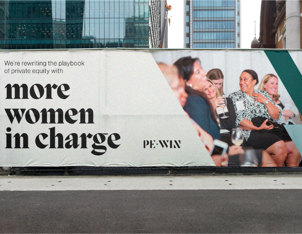
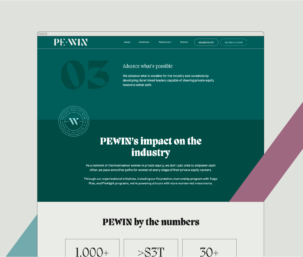
PEWIN, which stands for Private Equity Women Investor Network, is an exclusive network of the most senior women in private equity. Underrepresented and overdue for change in the industry, PEWIN came to us to bring clarity and unity to their organization, reimagining their identity and the way they talk about themselves to their members and within the industry.
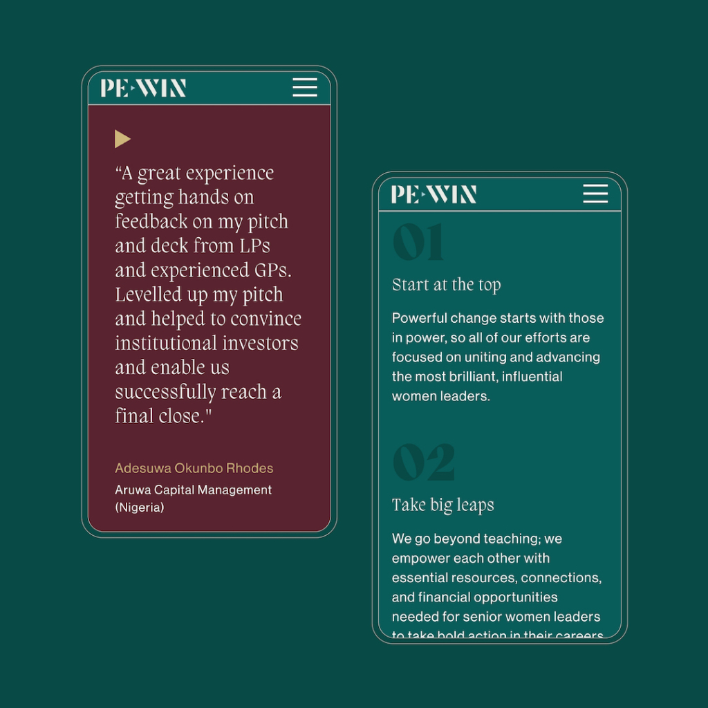
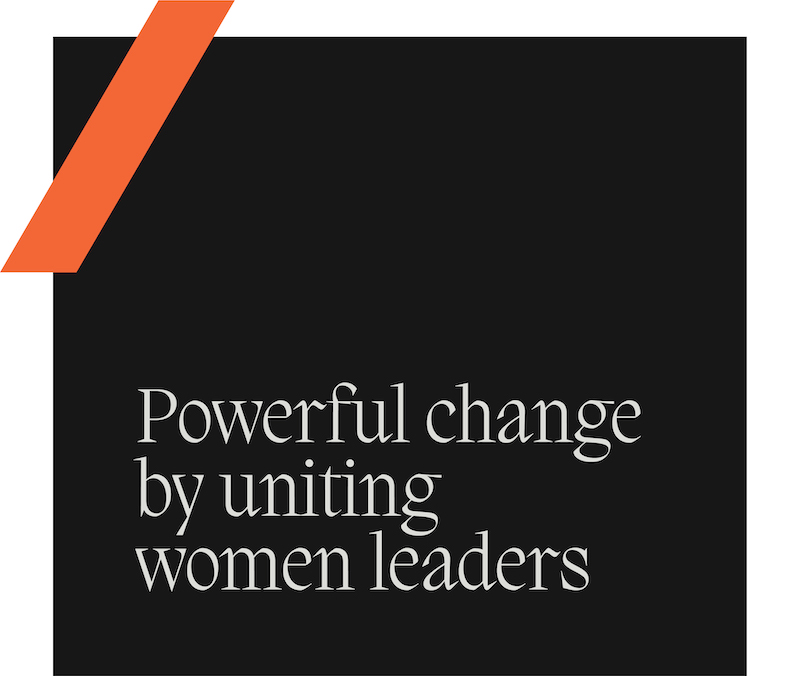
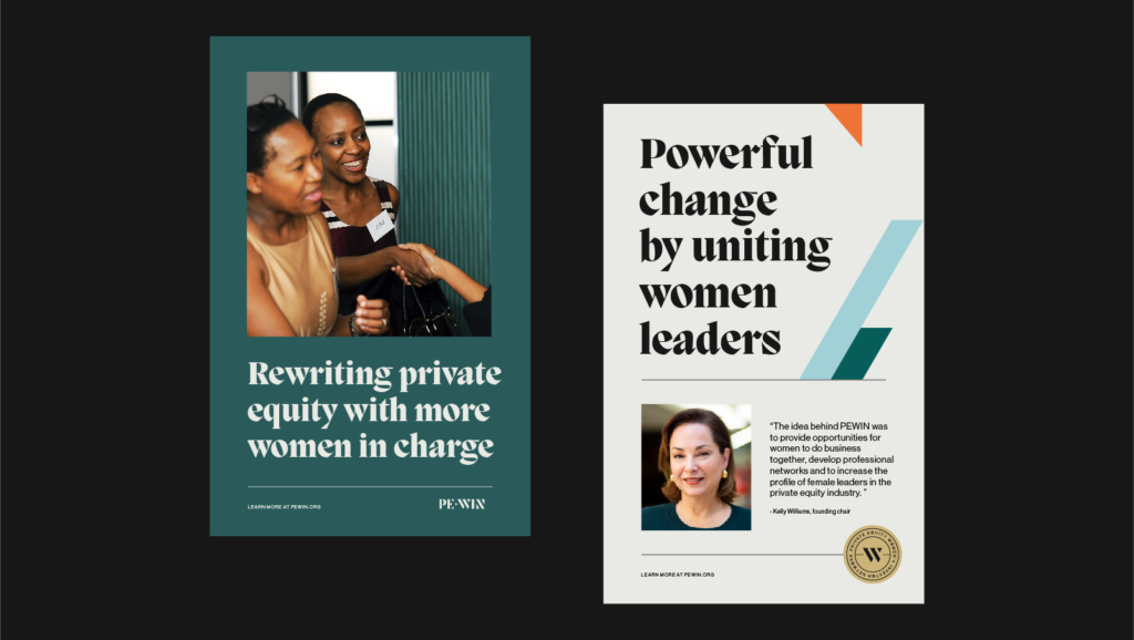
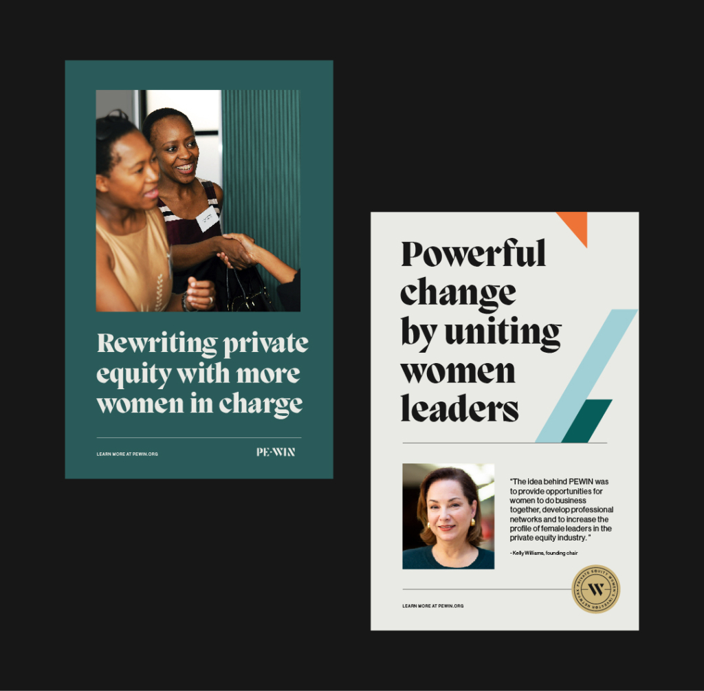
PEWIN exists to unite, empower and advance women leaders in the private equity industry. That powerful mission requires an equally powerful visual language that represents PEWIN members beyond gender stereotypes and category clichés. Elegant jewel tones, memorable typography, and an empowered voice come together to create a brand language as sophisticated as their network.
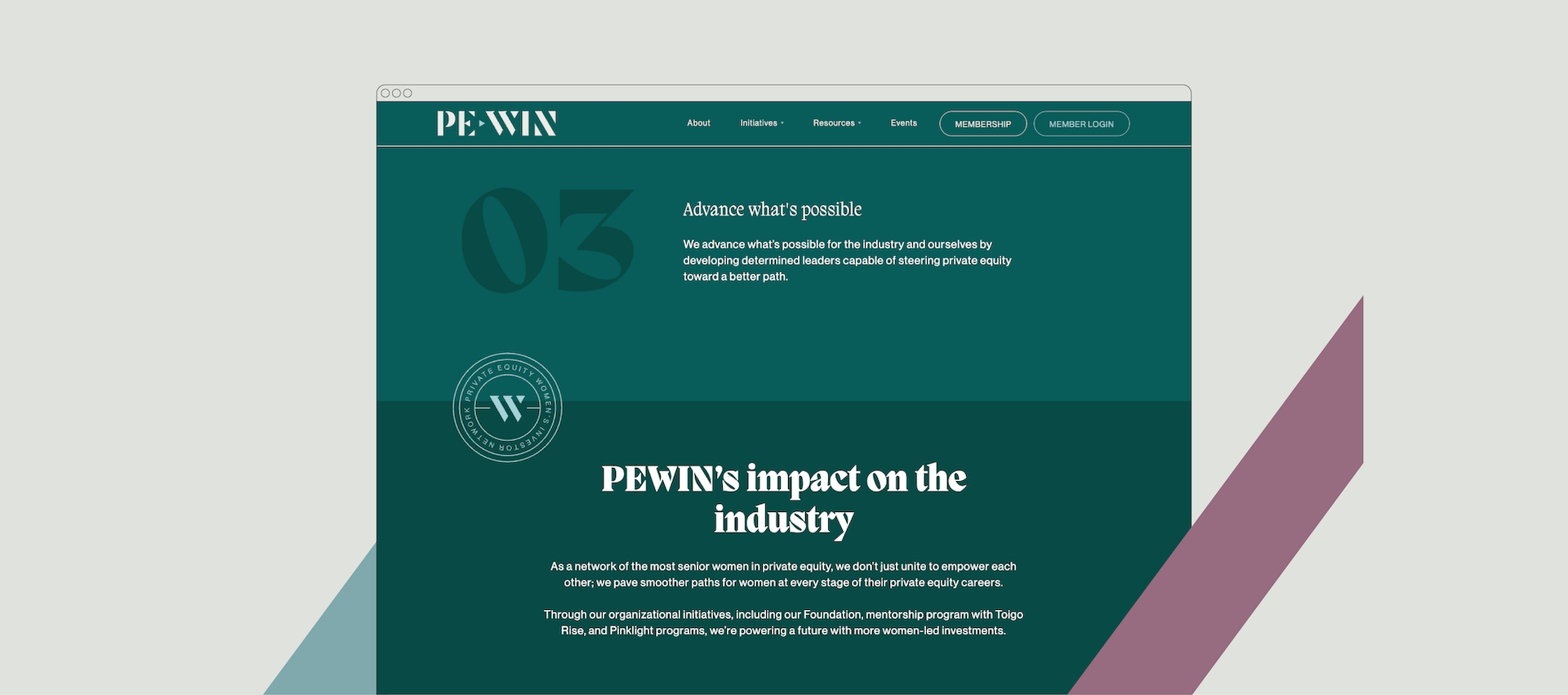
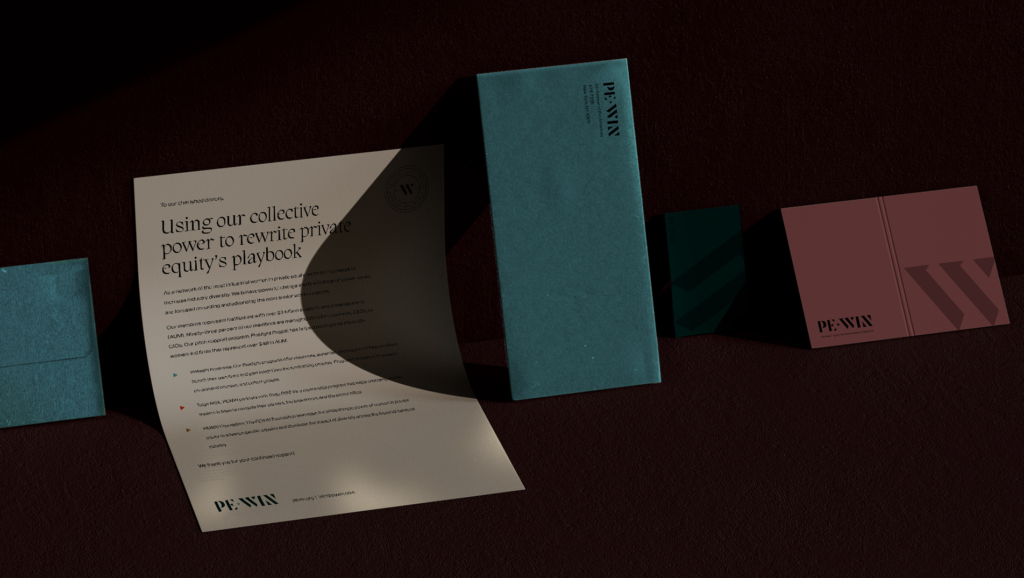
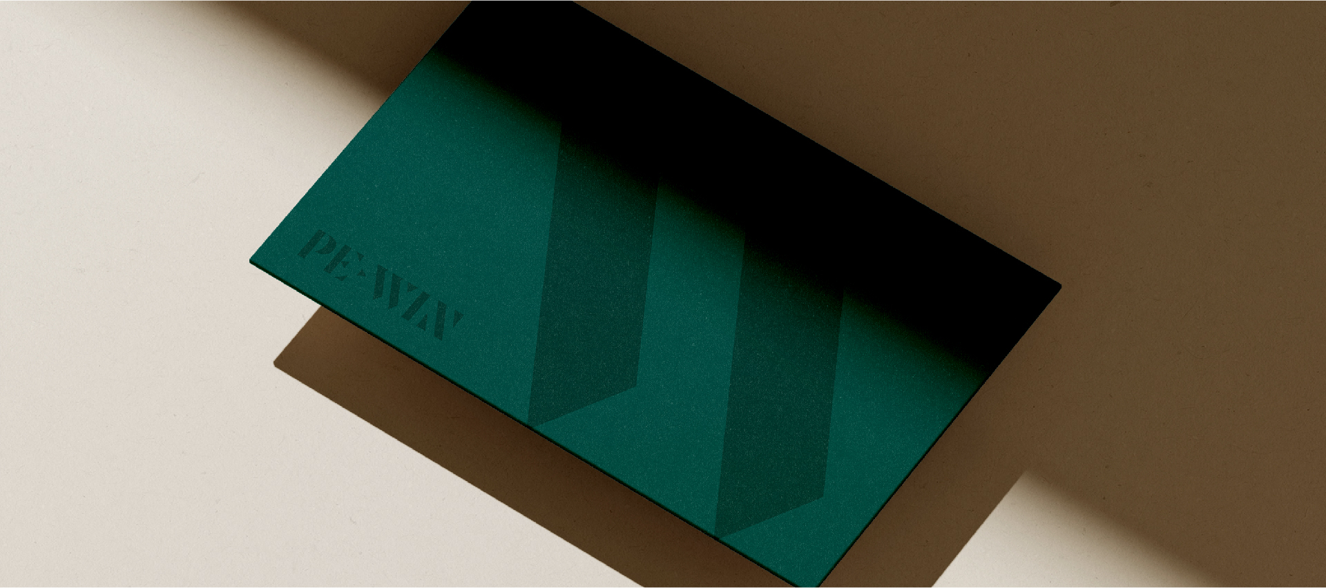
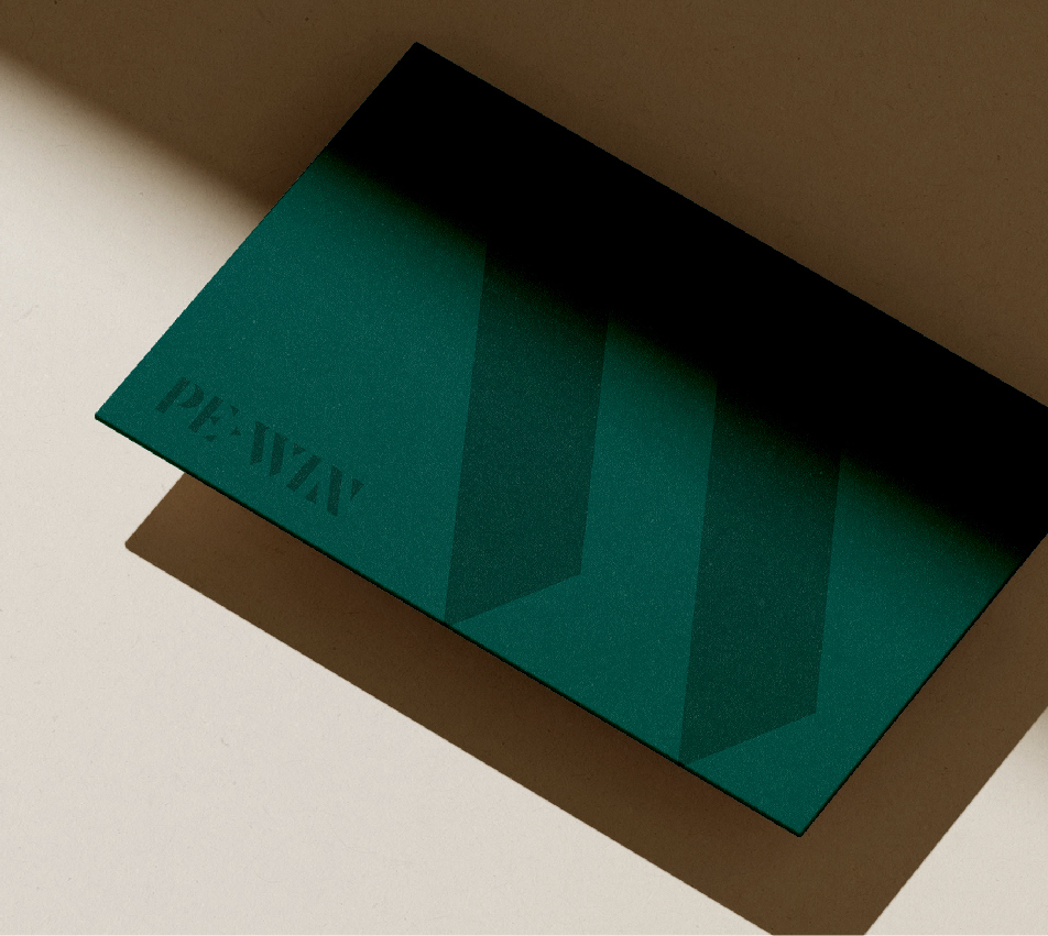
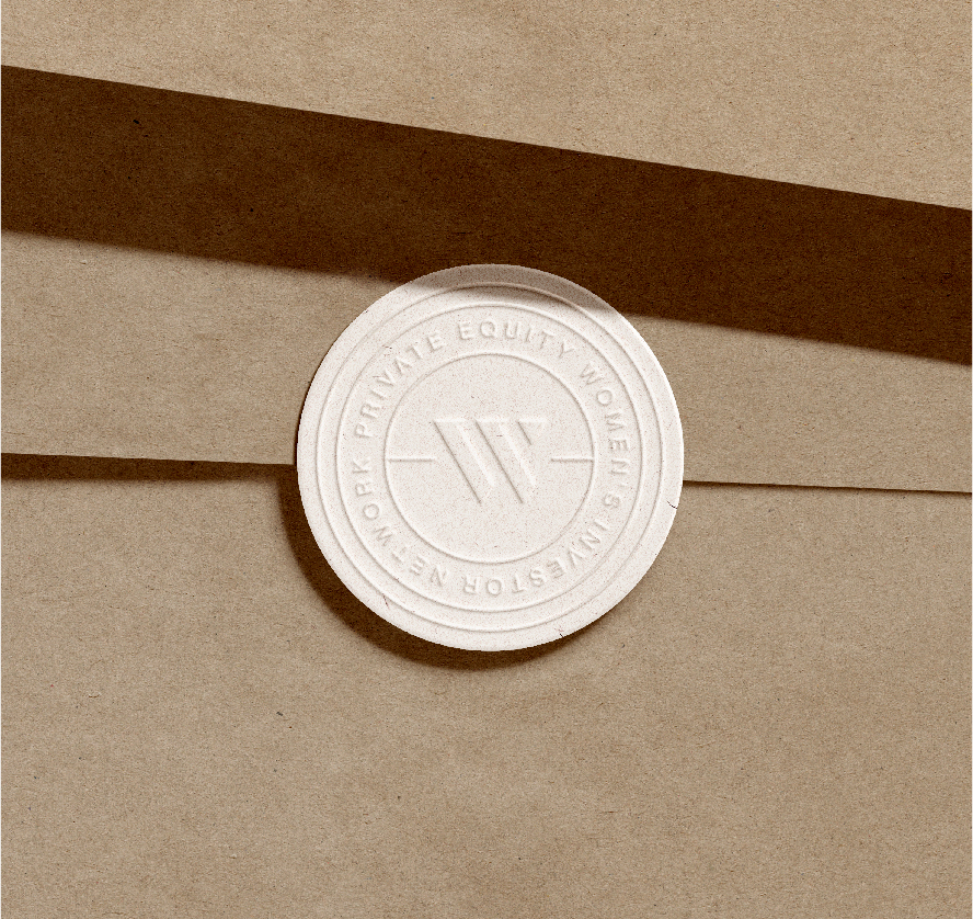
Rather than pulling the first letter of PEWIN’s name, the center letter “W” is the star, emphasizing the most important word in the acronym: women. Bold and directional with its angled lines, the W works as a brand mark and pulls apart into abstract shapes that make up the brand pattern.