Superior Sauna
- Brand Identity
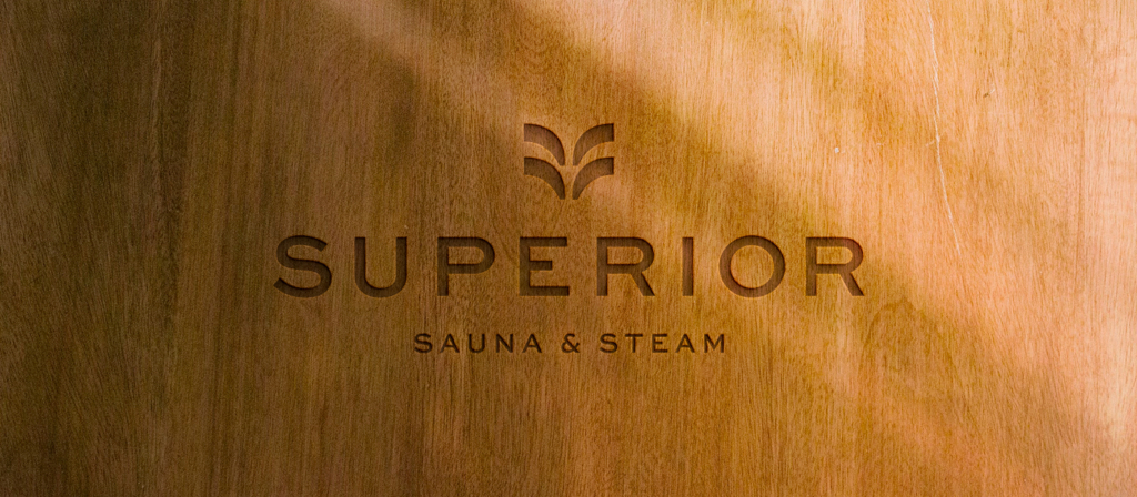
- Logo
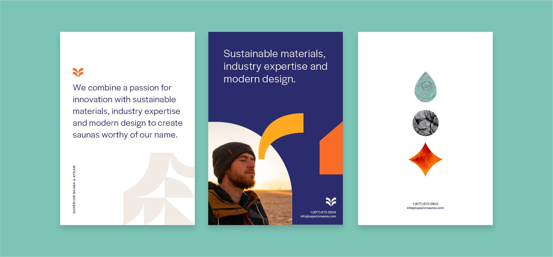
- Messaging
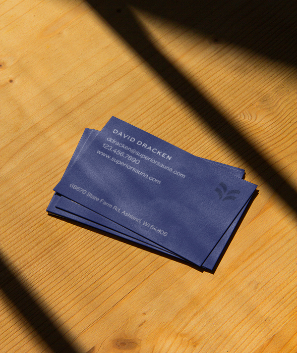
- Print Collateral
Superior Sauna
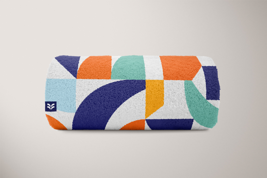
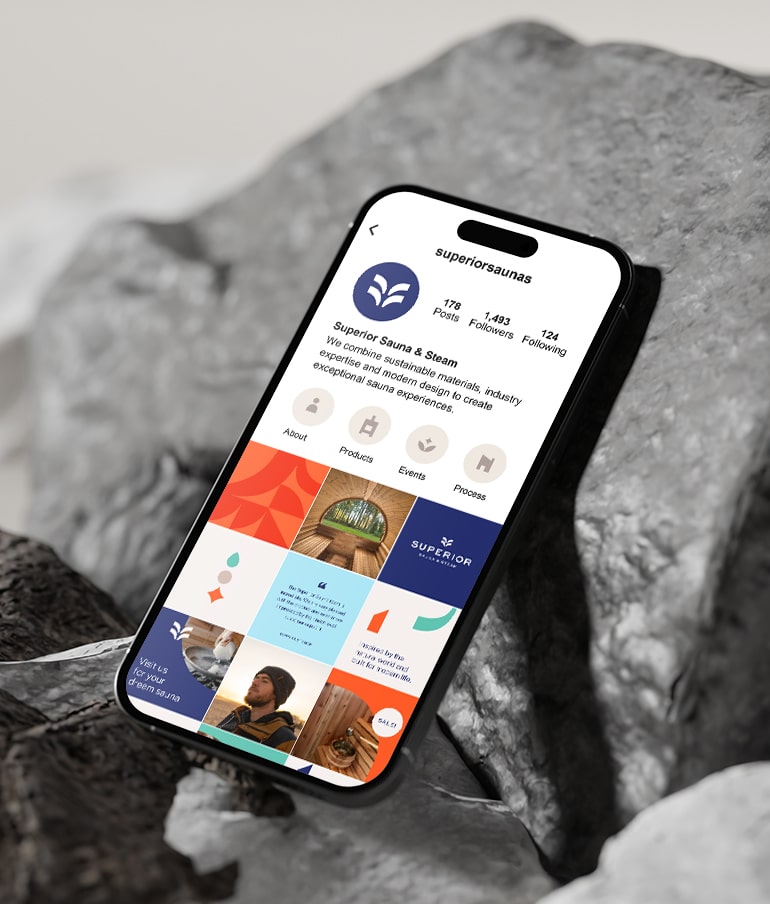
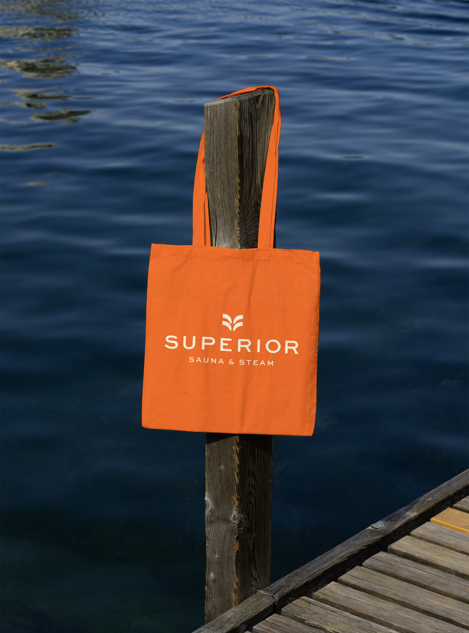
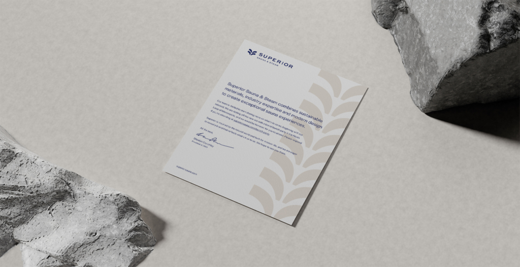
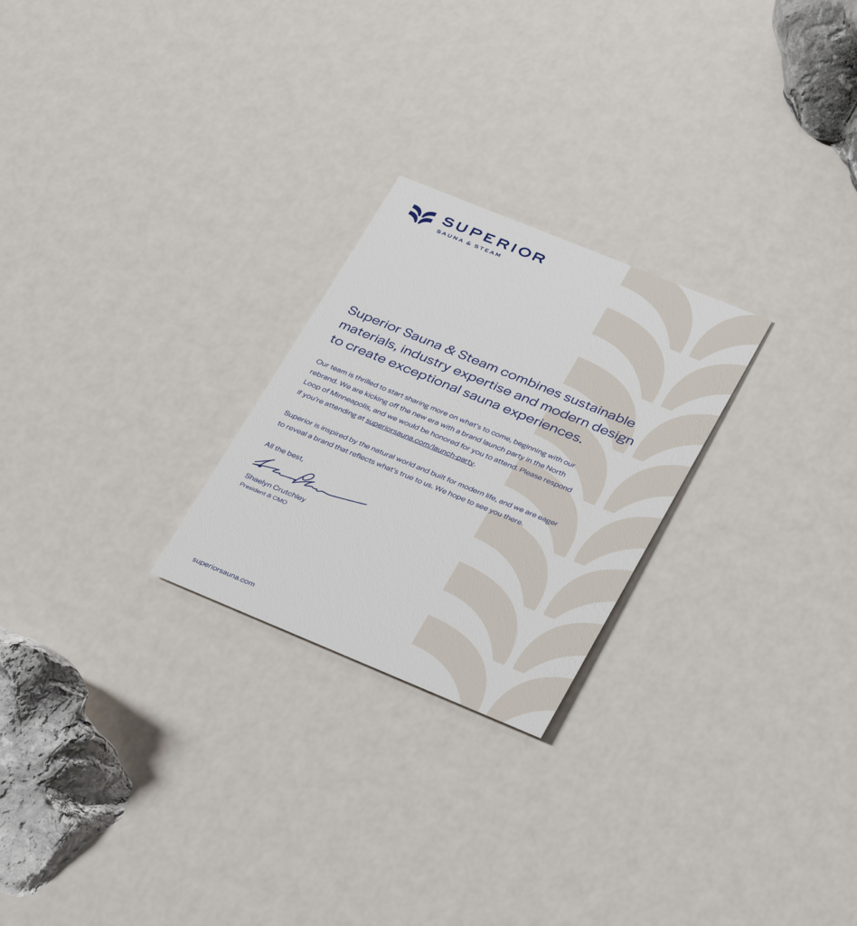
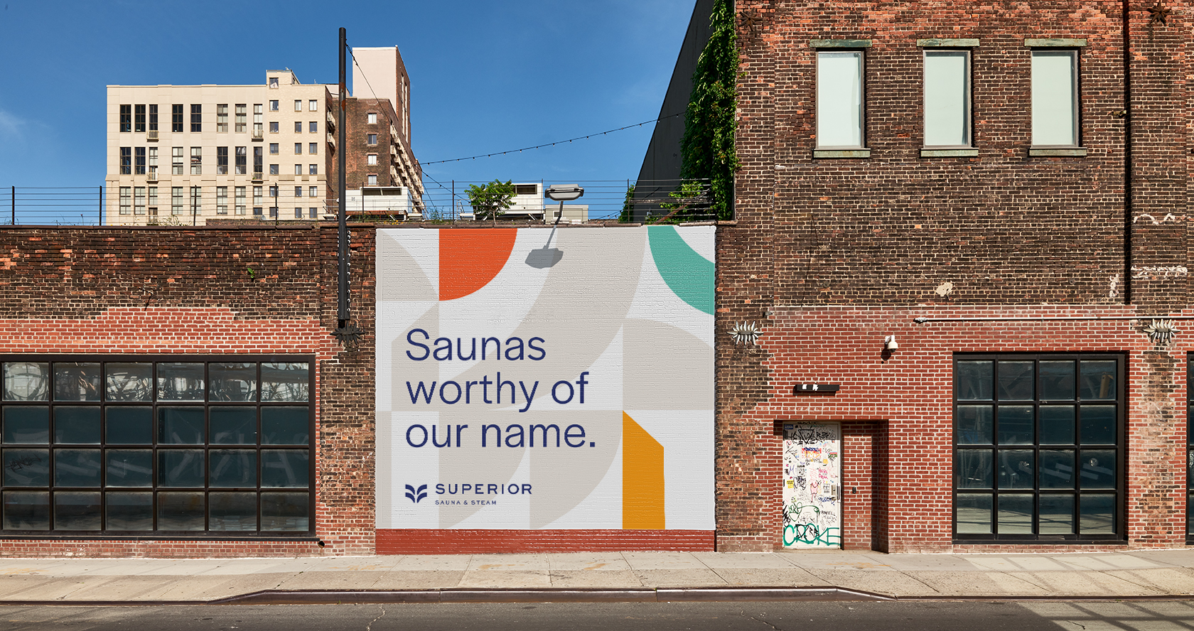
Superior Sauna approached us with a vision to revamp their brand, capturing a modern appeal that resonates with both customers and distributors. As leaders in their industry, they needed a brand language that not only mirrored their top-tier materials and profound expertise but also exuded their adaptable approach and unparalleled customer care. We crafted a vibrant brand language that harmonizes commanding shapes and trusted typography with inviting photography and a colorful pattern set.
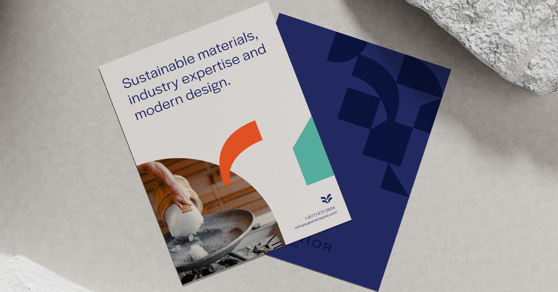
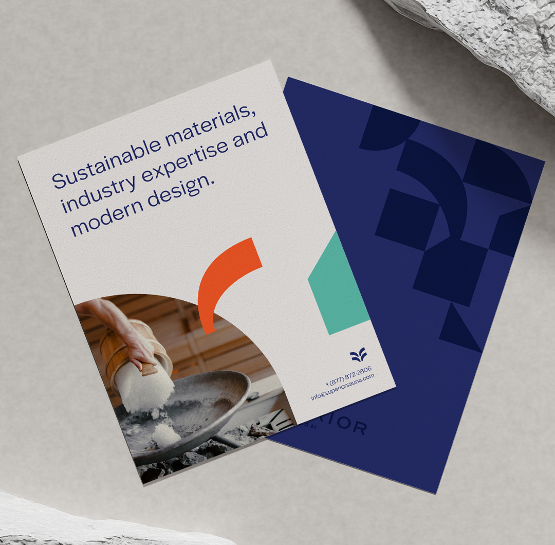
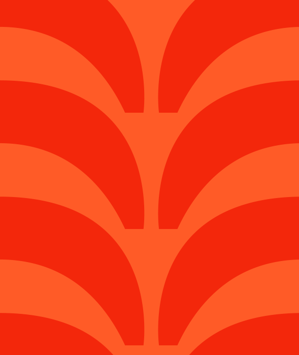
The shapes and patterns within the Superior Sauna visual identity are flexible and dynamic. In conservative, technical applications, they offer a subtle yet textured element. In more lively, consumer-facing contexts, they infuse a burst of energy and vibrant pops of color.
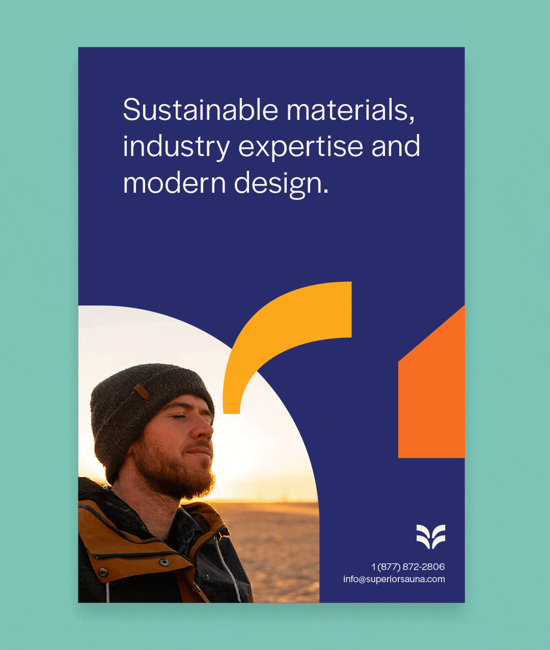
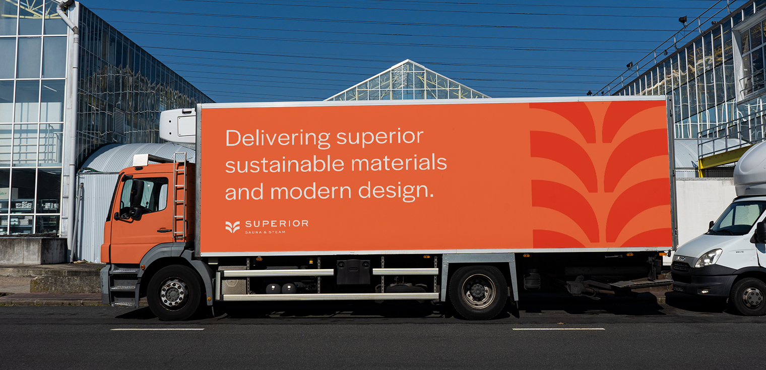
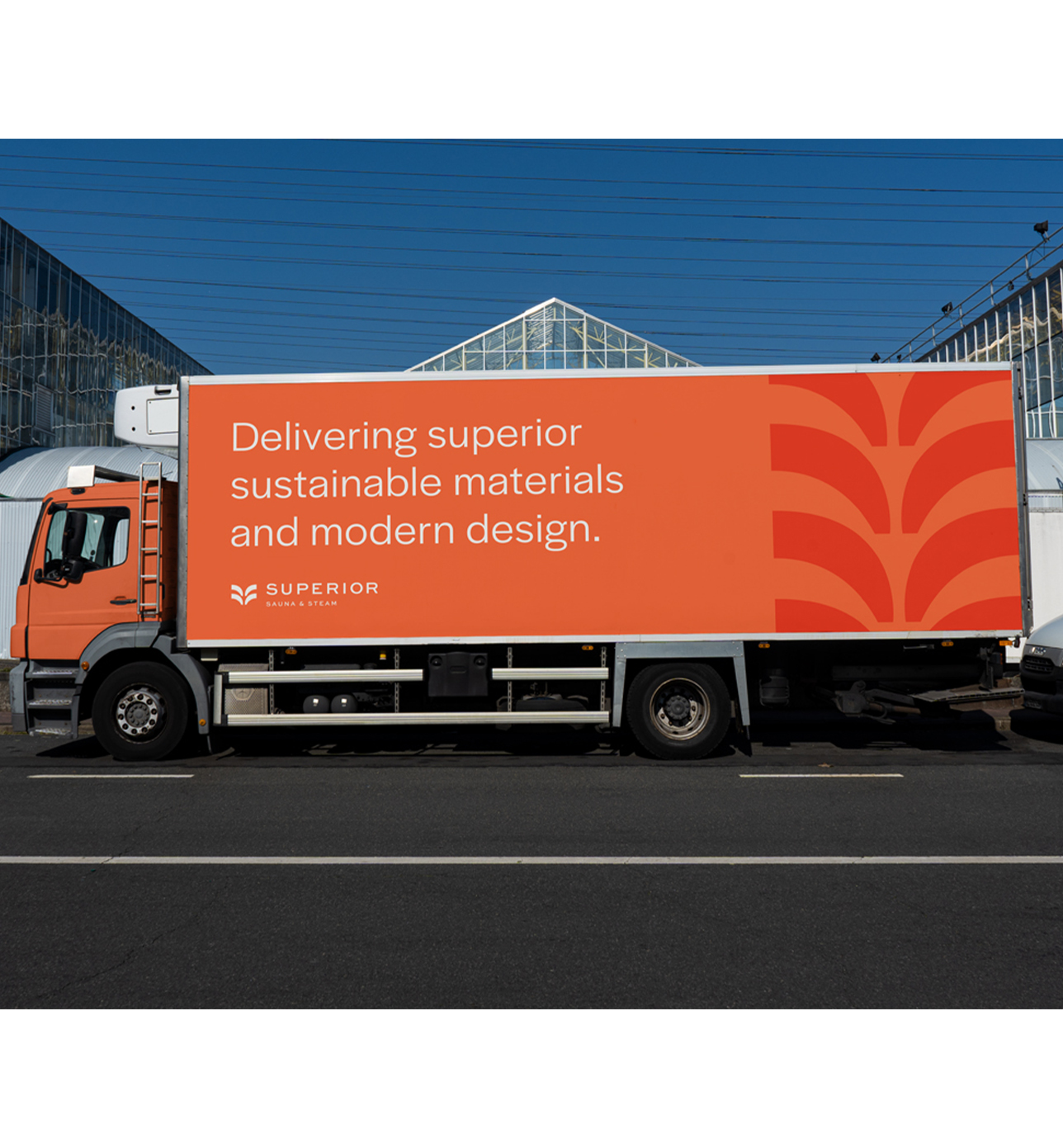
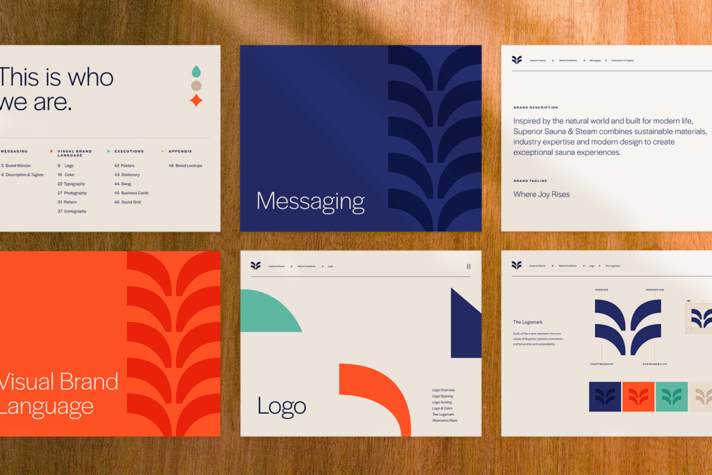
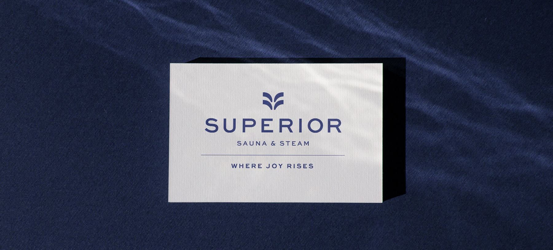
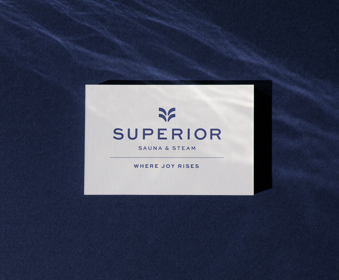
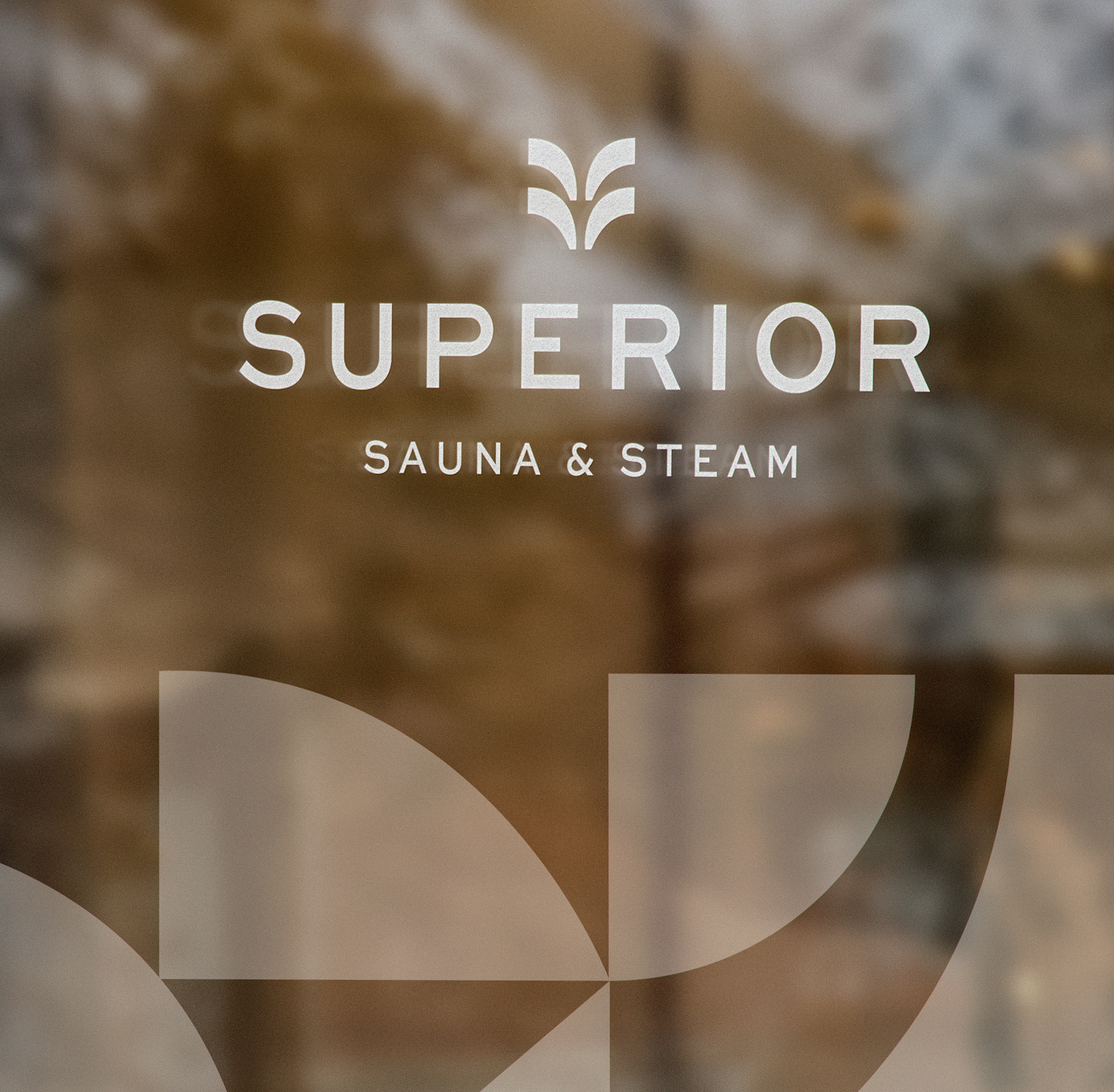
The logomark, composed of four arcs, embodies the essence of steam and upward movement. These arcs, alongside the negative spaces within the logo, became the foundational elements of our primary brand pattern. This pattern serves as a visual representation of the diverse array of materials and products employed by Superior. Each element comes together, akin to pieces in a puzzle, to craft a distinctive and personalized sauna experience for every customer.
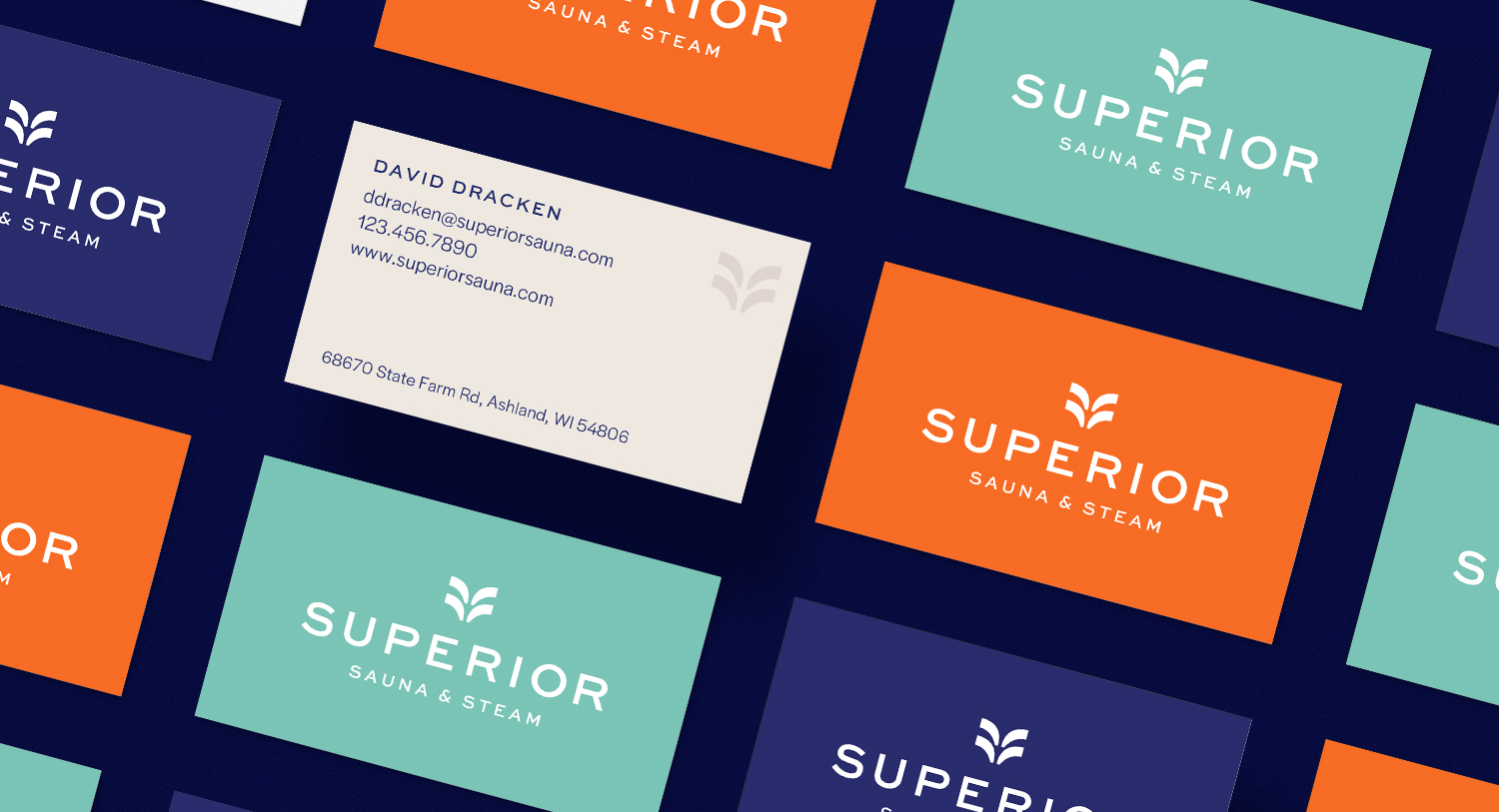
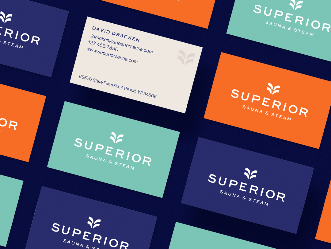
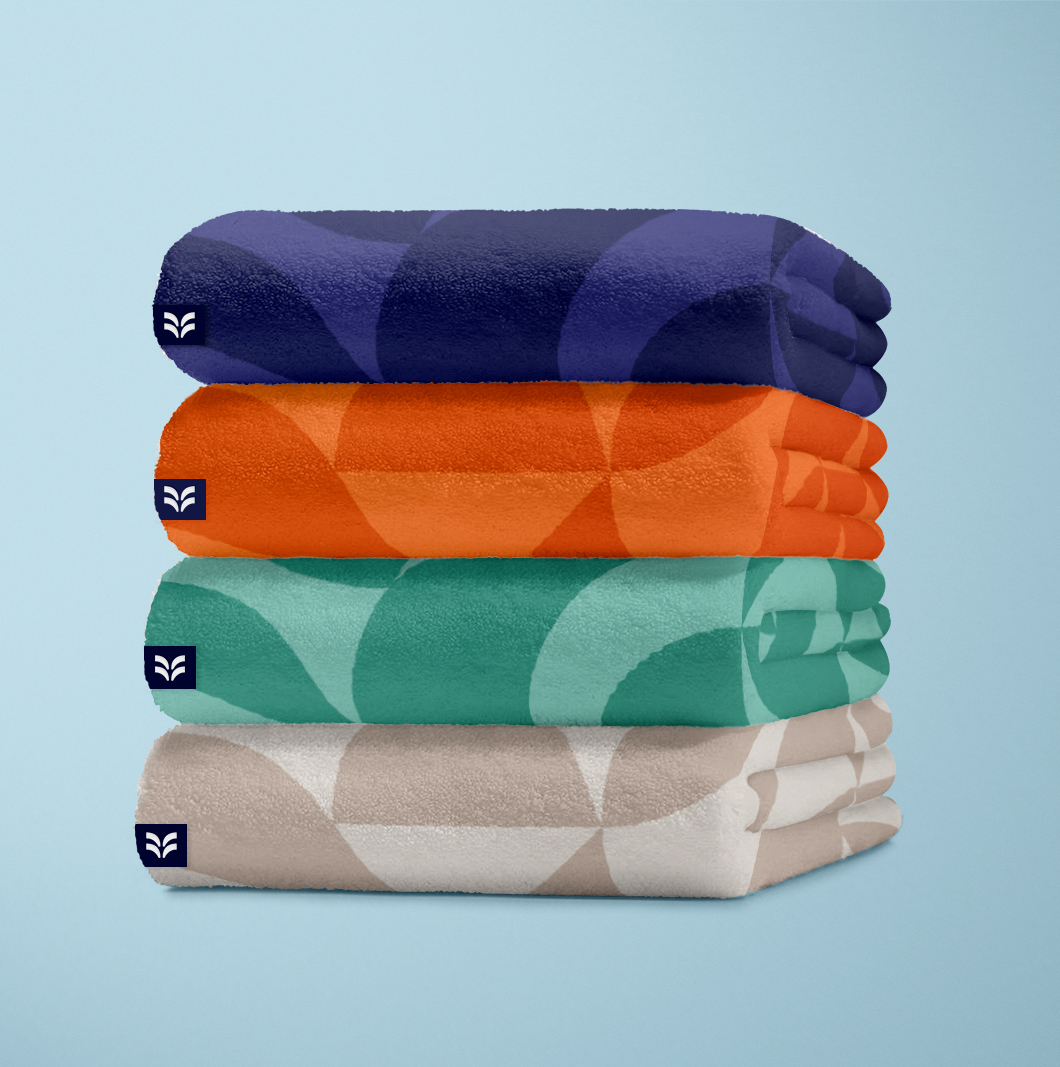
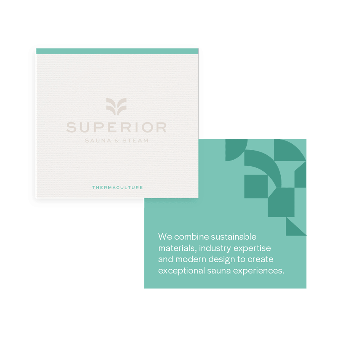
Our development of the Superior color palette drew inspiration from the fundamental components of sauna: water, heat, and stone. We also crafted a versatile range of secondary tones, designed to effortlessly cater to different audience groups.