Tadera
- Art Direction
- Brand Identity
- Logo
- Website Design
Tadera
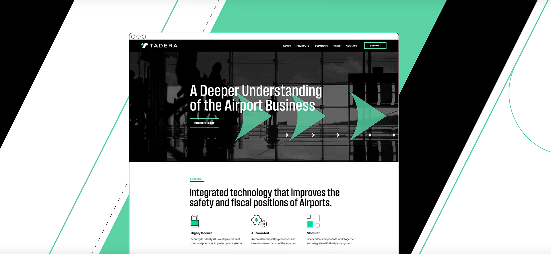
Tadera, a technology company focused on improving the safety and operations of airport systems, approached us to create a brand language reflecting their efficient and intelligent airport software solutions. The end product was a modern take on aeronautical design, highlighting directional, way-finding visual elements.
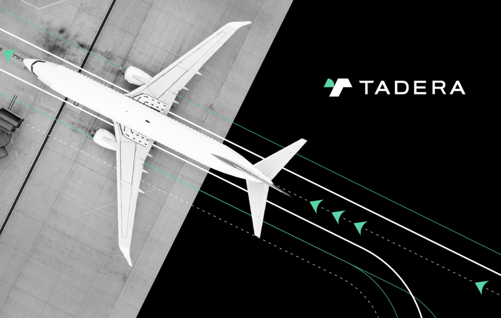

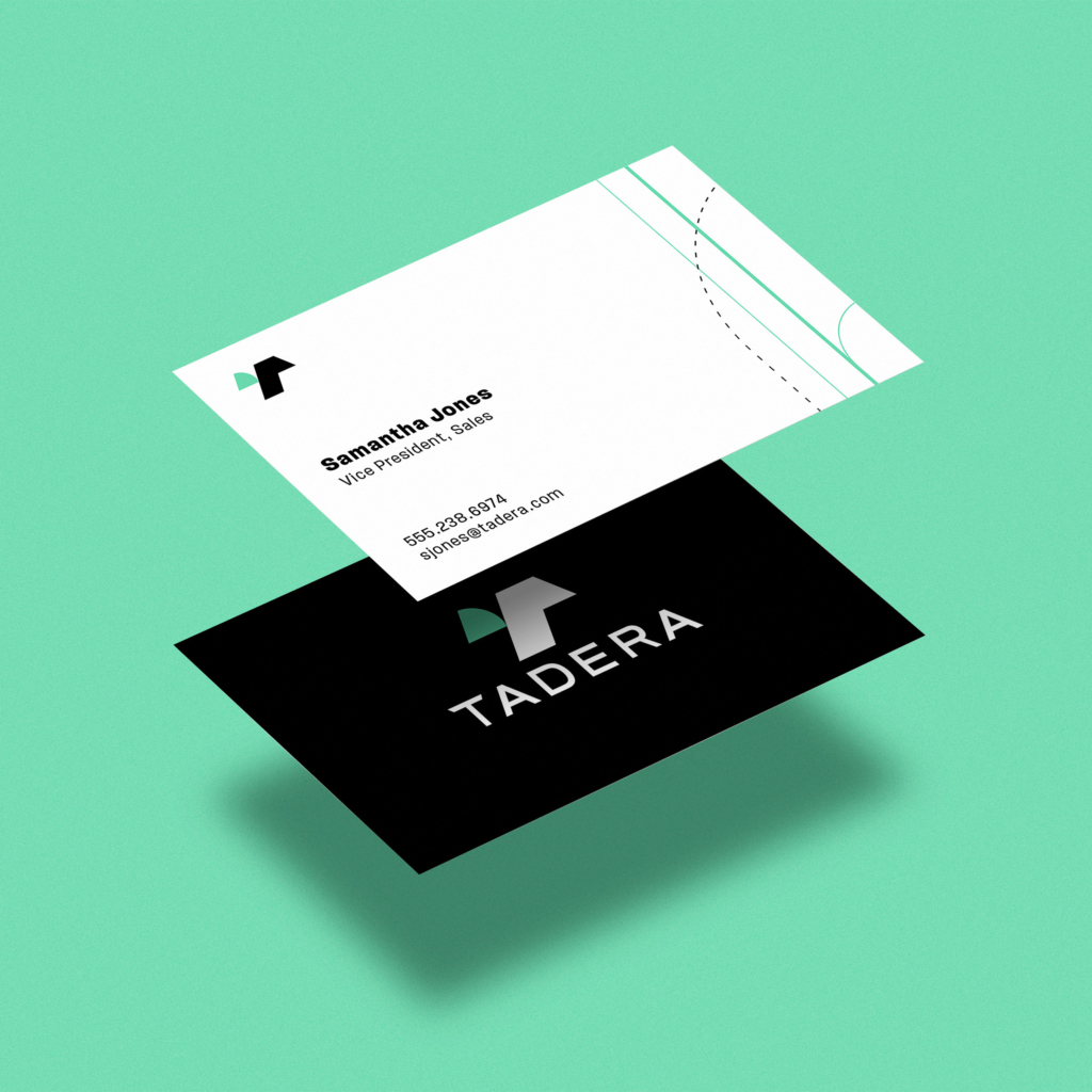
The Tadera logo uses negative space to highlight the directional, upward arrow that is used prominently throughout the visual language system.
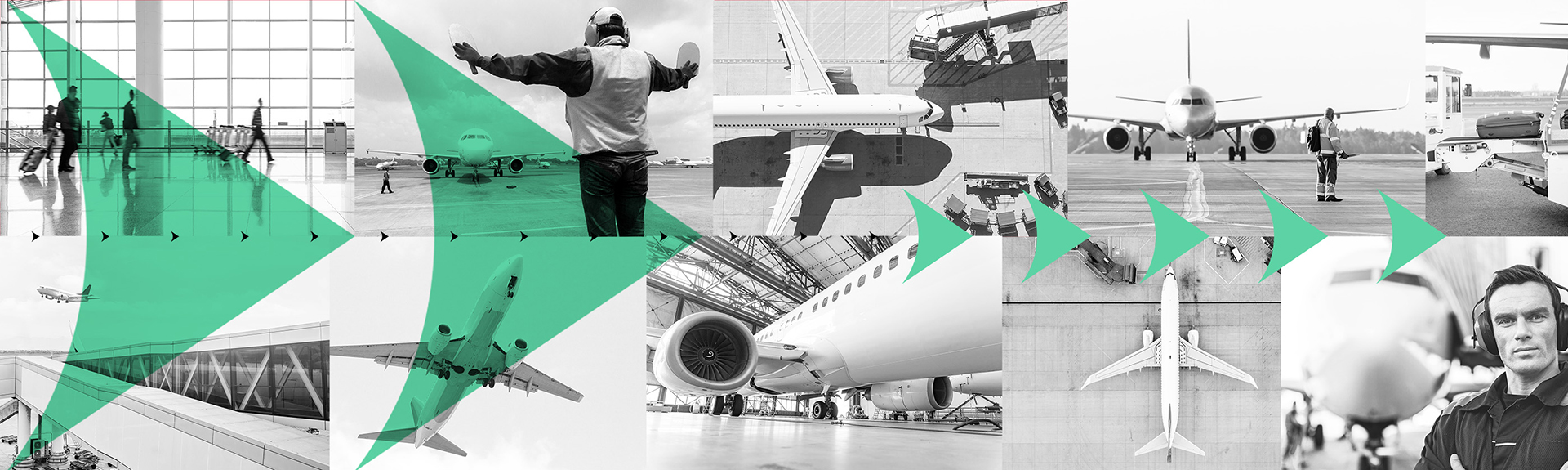


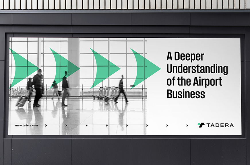
All of the design elements throughout the visual design system help create a feeling of movement, process and efficiency.
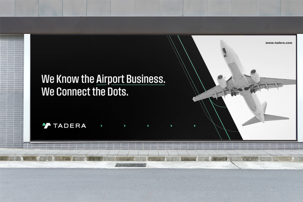
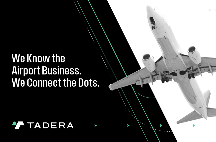
All of the design elements throughout the visual design system help create a feeling of movement, process and efficiency.