Jair Lynch Real Estate
- Brand Identity
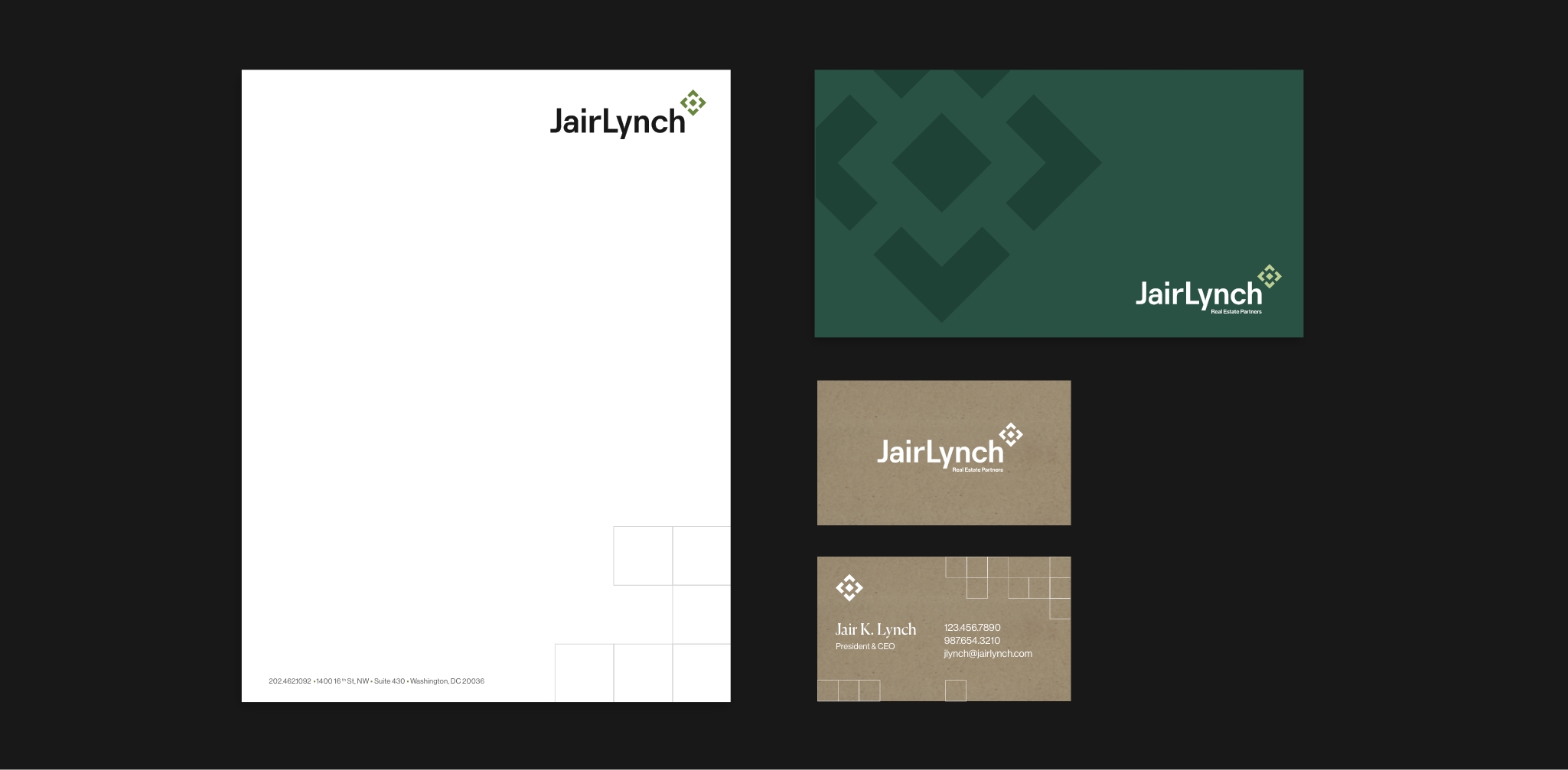
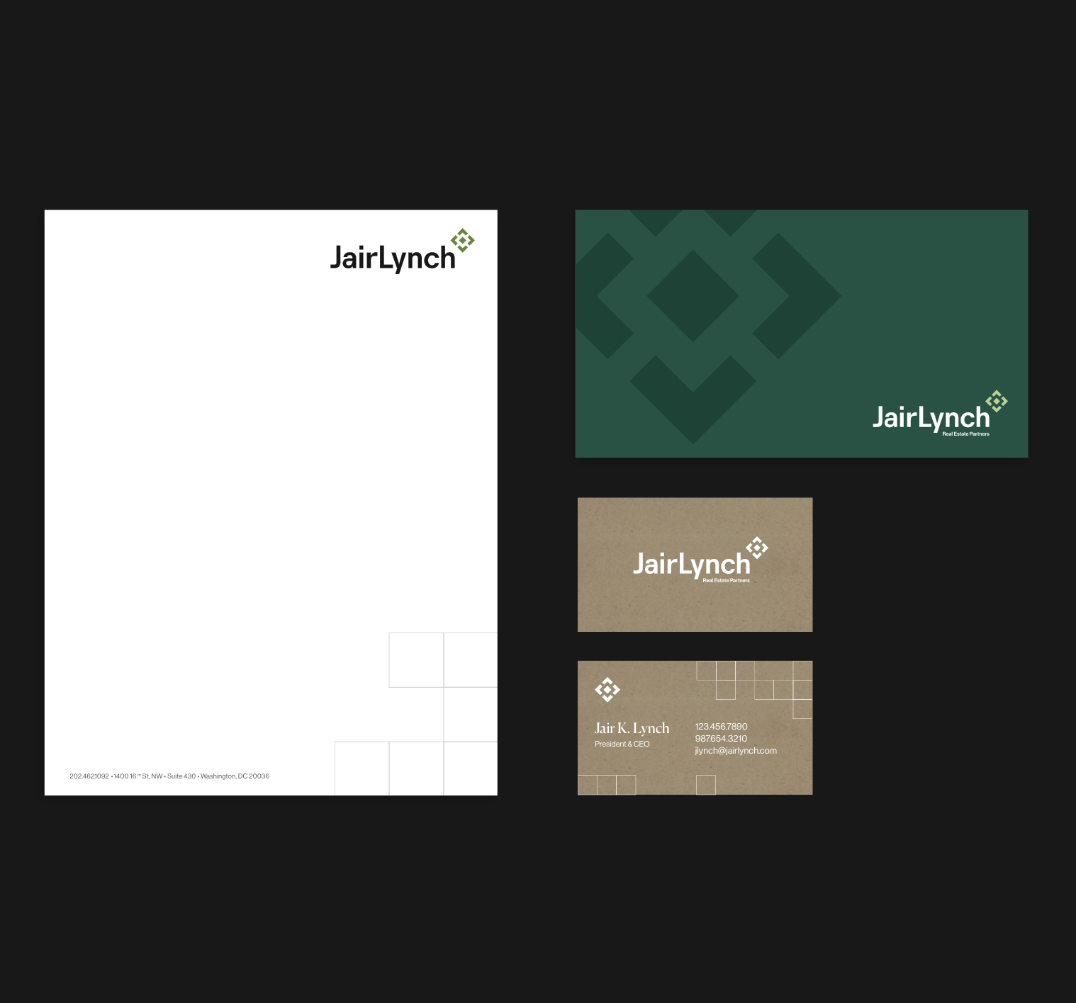
- Logo
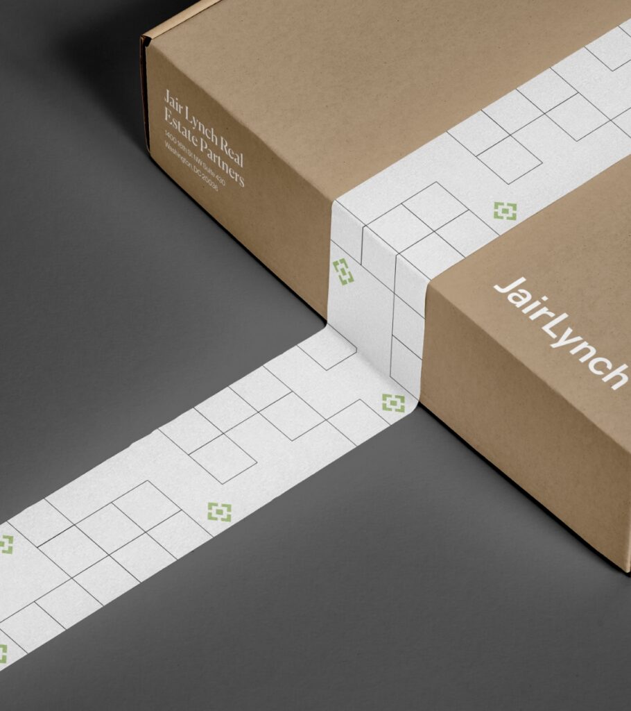
- Print Collateral
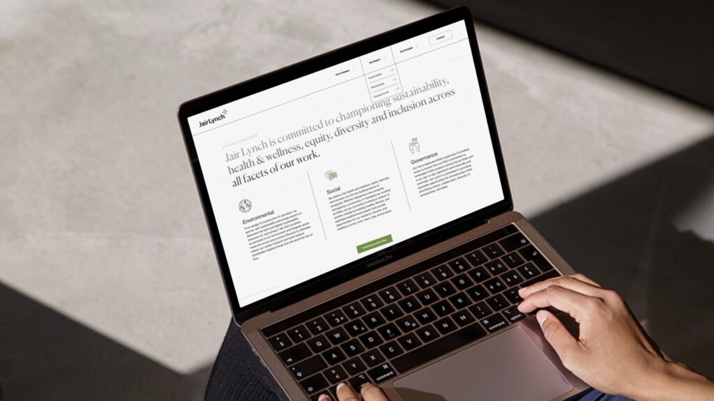
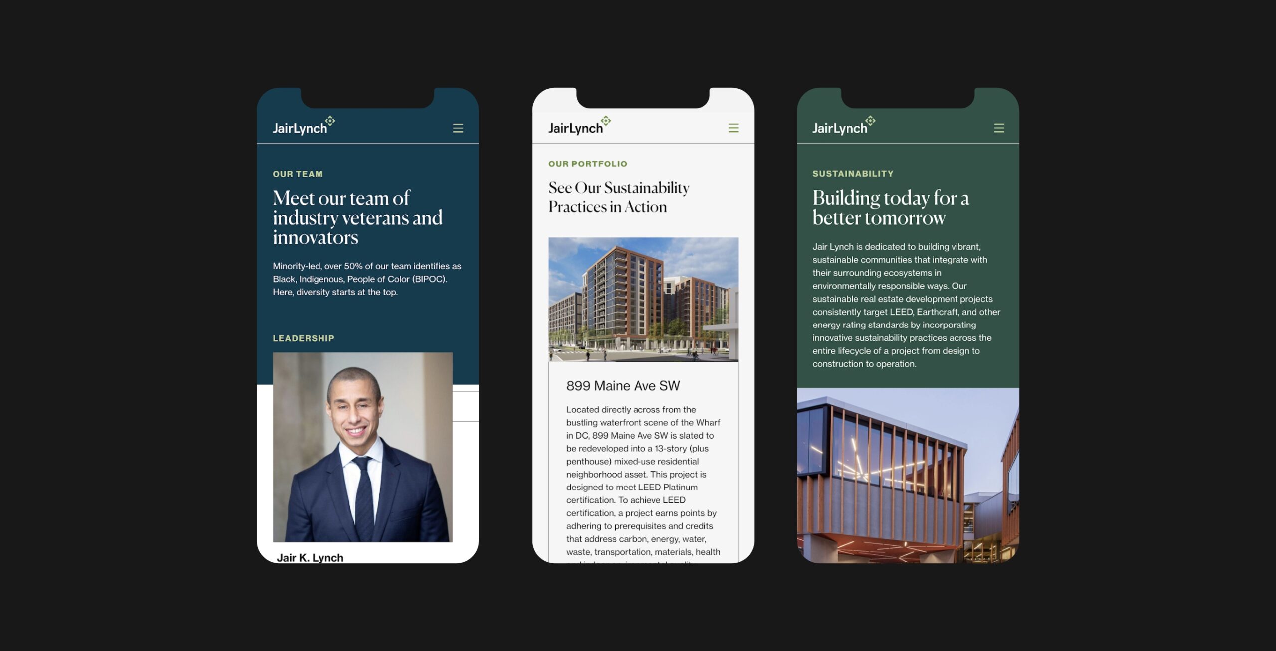
- Website Design
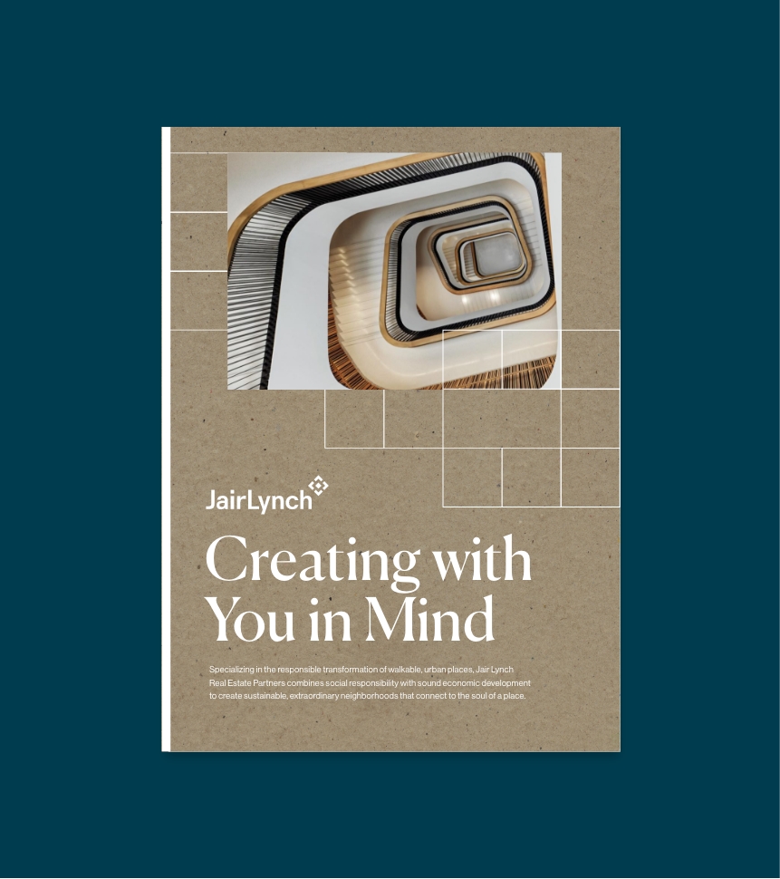
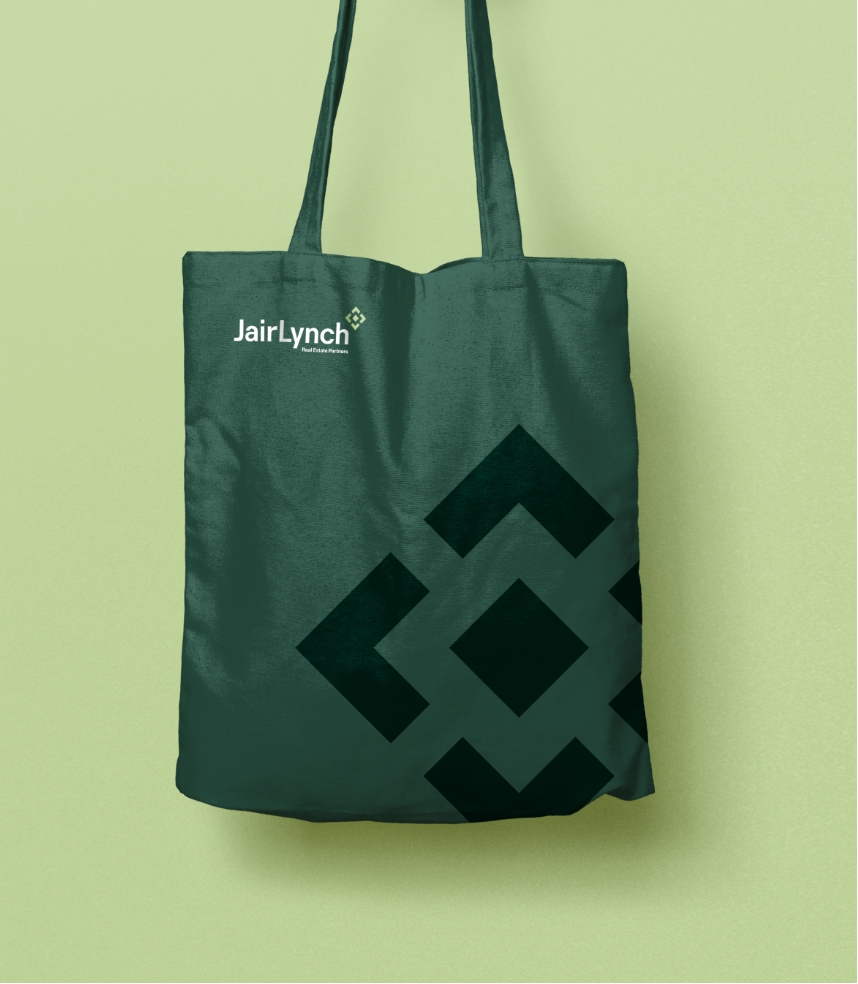
Jair Lynch Real Estate Partners
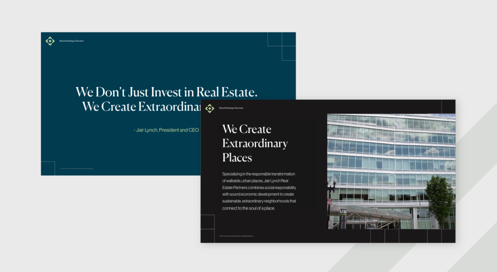
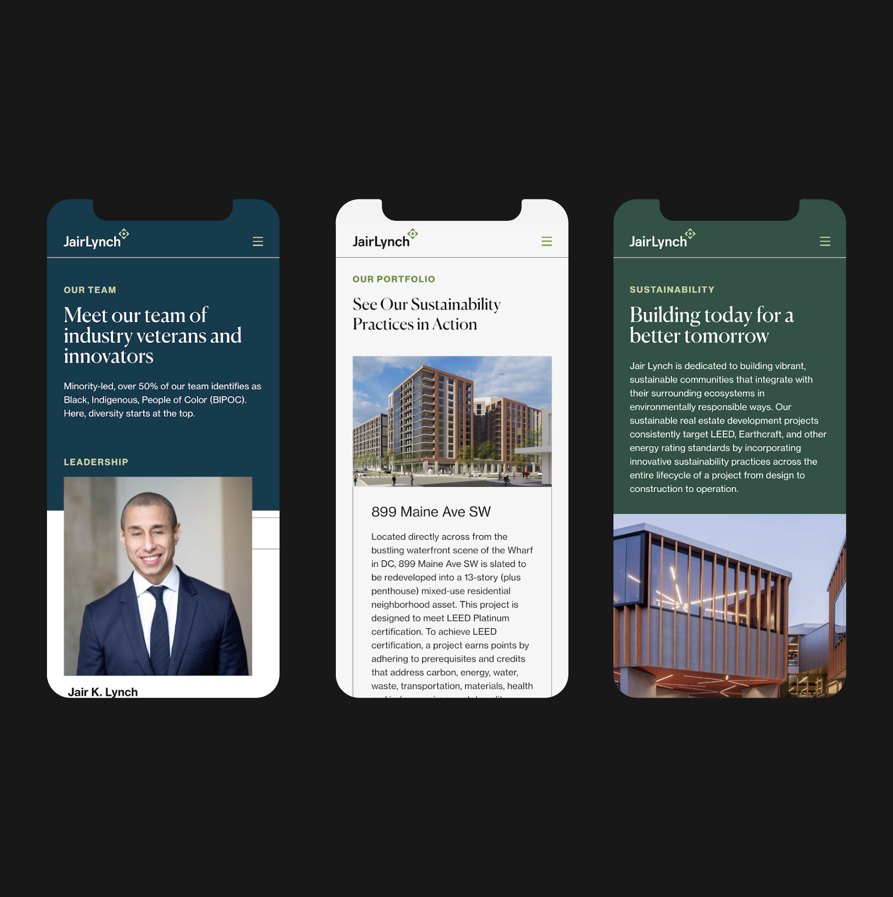
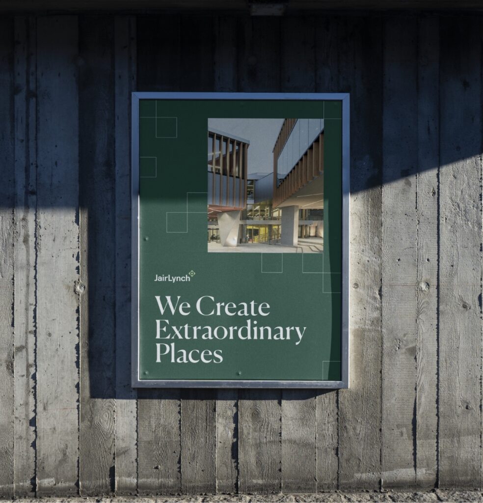
Jair Lynch stands out in the industry as a leader in sustainable and human-focused design and they needed their brand to reflect that. To elaborate on their mission, we created a visual identity and website that evolved their current brand to feel more progressive. Structured, professional design systems are balanced with an organic color palette, bringing to life a brand that stands out among competitors and aligns with their company mission.
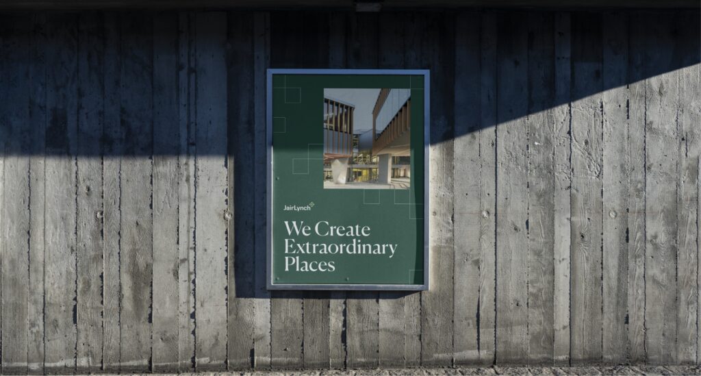
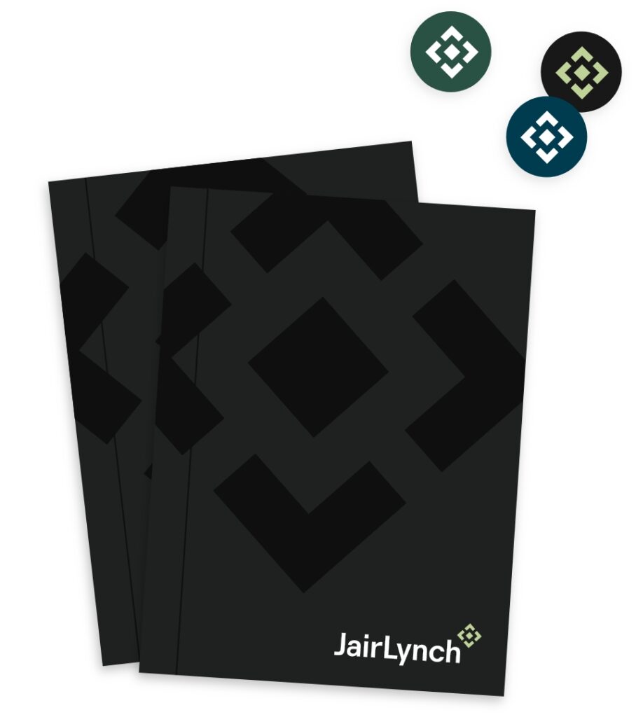
The simple & scalable logomark packs a lot of meaning into a simple shape: pathways, a city block, navigational arrows, and even the letters J and L.