Formic
![Case Study Icon](https://magentacreative.com/wp-content/uploads/2021/12/Formic_logo.png)
- Brand Identity
- Logo
- Website Design
Formic
We partnered with Day&Age, a creative agency in Minneapolis, to create a new brand for Formic. Our assignment was to help drive business and convey the premium service they’re bringing to the automation industry. We developed new brand positioning, messaging, and a modern visual language—including a refresh of their logo, color palette, iconography, typography, and photo treatments.
![](https://magentacreativ.wpengine.com/wp-content/uploads/2022/03/Posters_Formic2-1024x576.jpg)
![](https://magentacreativ.wpengine.com/wp-content/uploads/2022/03/LogoVariations.gif)
![](https://magentacreativ.wpengine.com/wp-content/uploads/2021/12/Formic_Robots-1024x813.jpg)
![](https://magentacreativ.wpengine.com/wp-content/uploads/2022/03/BusinessCards_Formic.jpg)
![](https://magentacreativ.wpengine.com/wp-content/uploads/2021/12/Formic-Main-Logo2-1024x957.jpg)
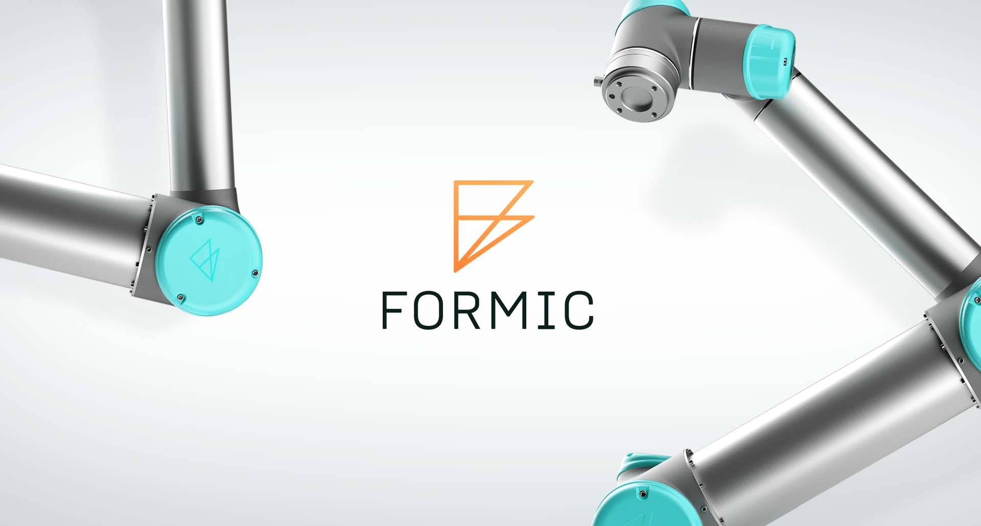
The Formic logo resembles an abstracted F using flat triangular shapes to create 3-dimensional depth. The concept represents the dimension added to manufacturing that didn’t previously exist.
![](https://magentacreativ.wpengine.com/wp-content/uploads/2021/12/2_Formic-1.jpg)
![](https://magentacreativ.wpengine.com/wp-content/uploads/2022/03/Retouched-Image-Example-1024x576.jpg)
![](https://magentacreativ.wpengine.com/wp-content/uploads/2021/12/Formic_Icon-loop.gif)