Minneapolis Cider Co
- Brand Expansion
- Illustration
- Packaging
Minneapolis Cider Co
Beloved local cidery Minneapolis Cider Co approached us for a refreshed can packaging design system. We crafted bold, simple layouts with custom patterns along the bottom, incorporating angular paper-cut illustrations to showcase the ingredients and personality of each cider flavor. The result is a style that’s uniquely ownable in a saturated industry.
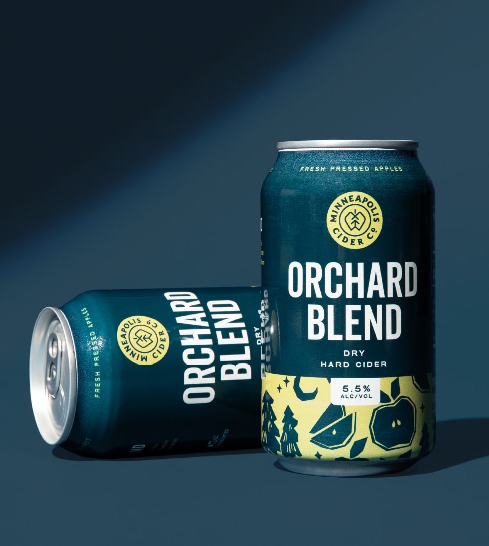
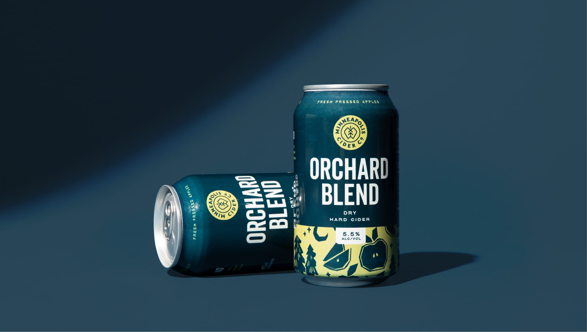
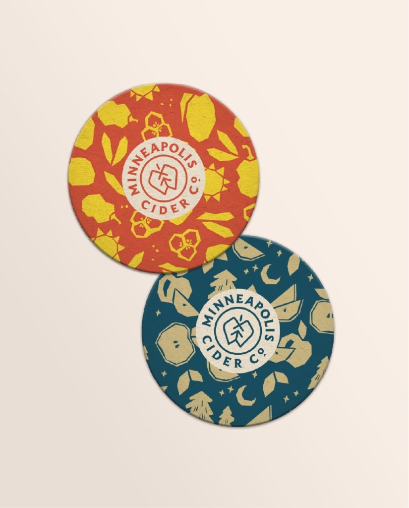
Original illustrated patterns showcase the ingredients of each flavor, complemented by nods to Minnesota’s natural environment.
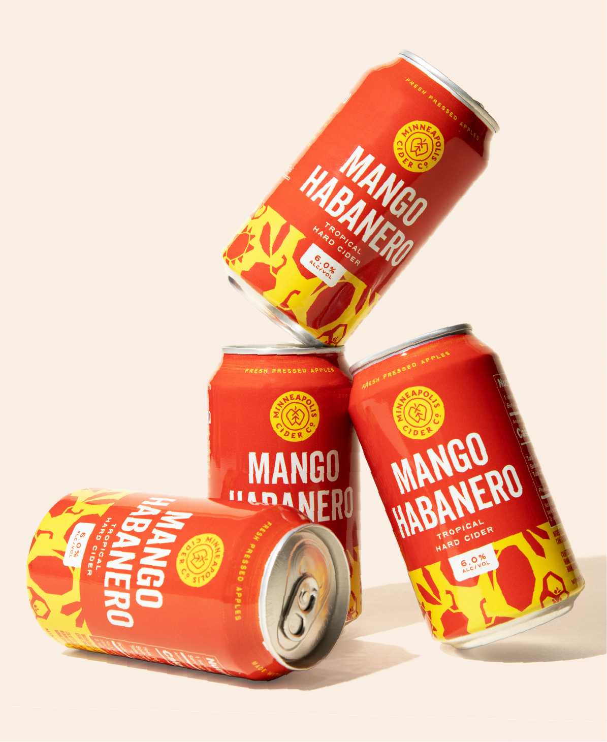
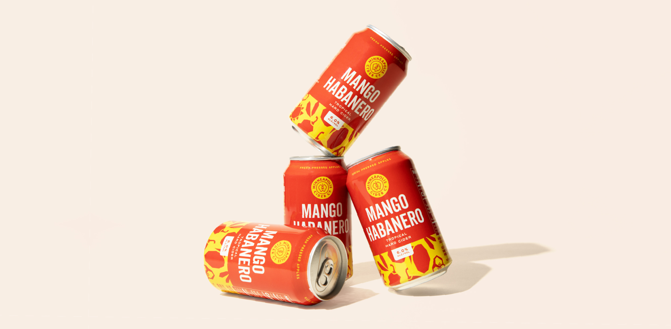
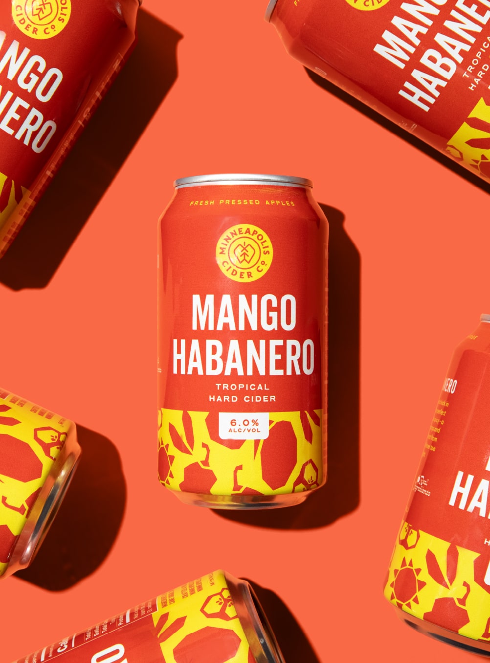
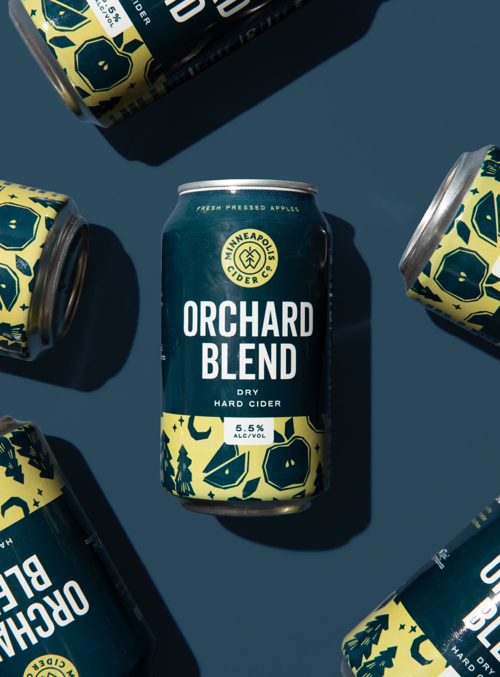


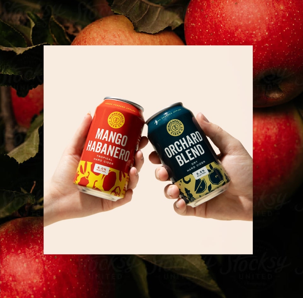
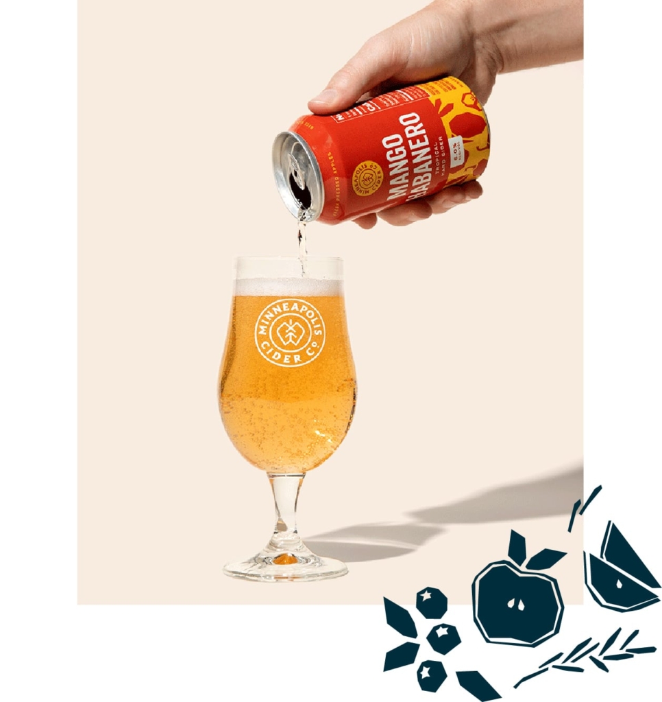
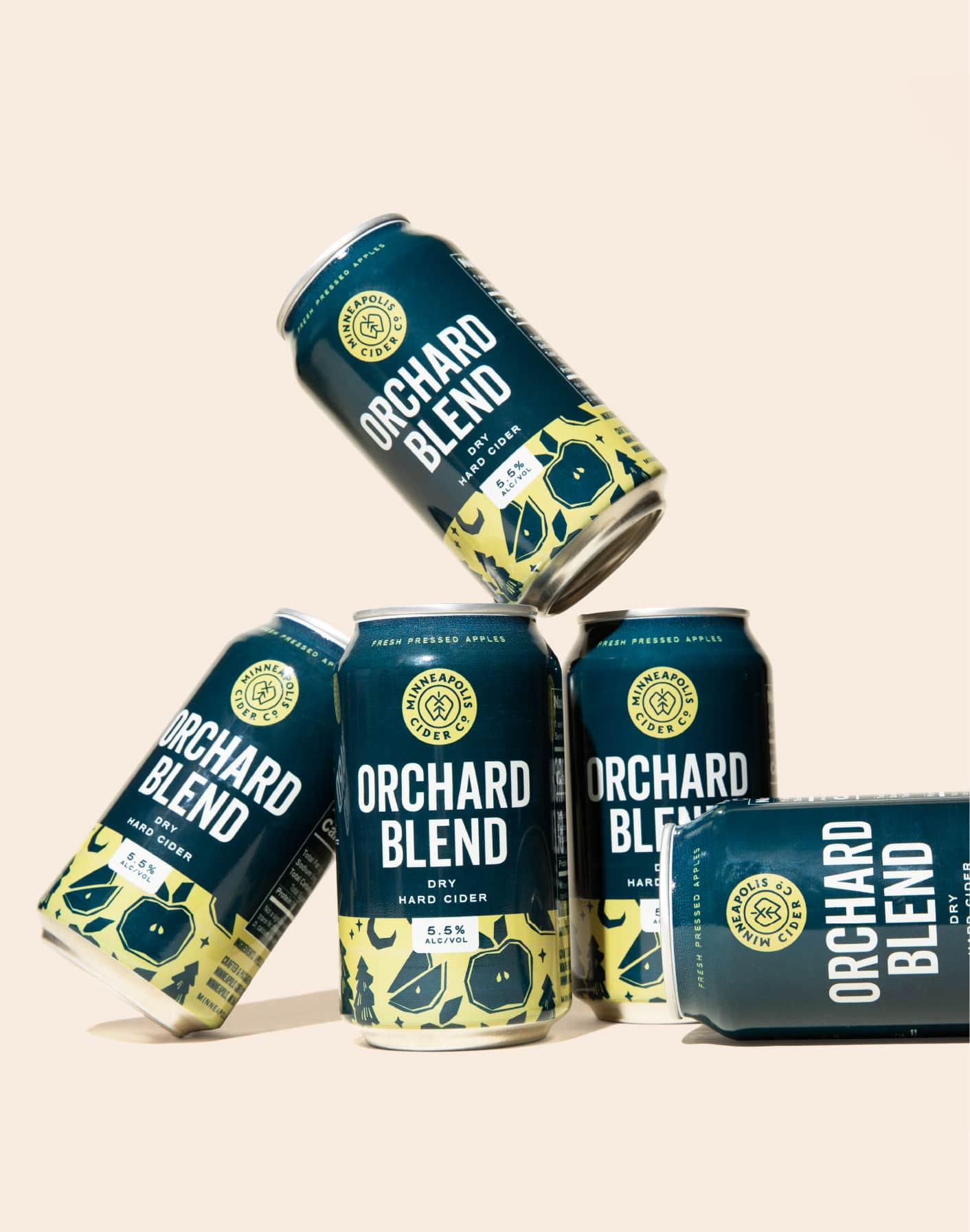
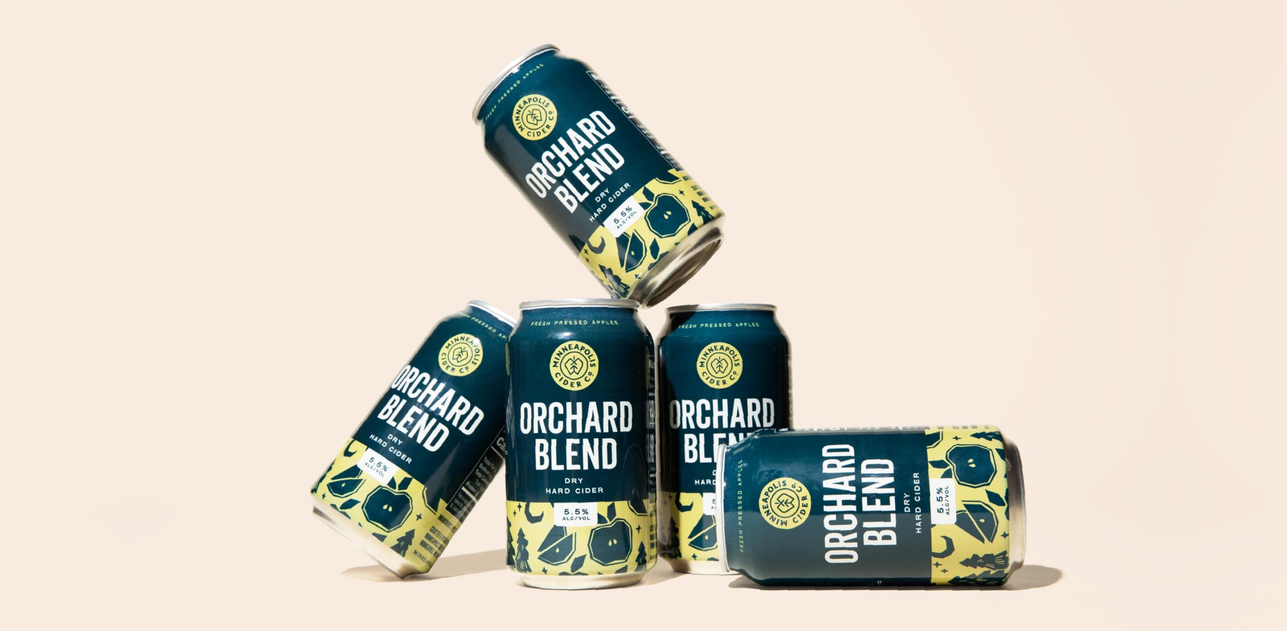
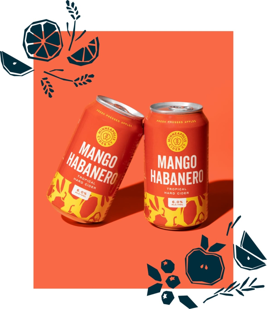
Each flavor distinguishes itself with two high-contrast colors and a bold typographic treatment for its name.