Keystone Group International
- Brand Identity
- Logo
- Messaging
- Website Design
Keystone Group International
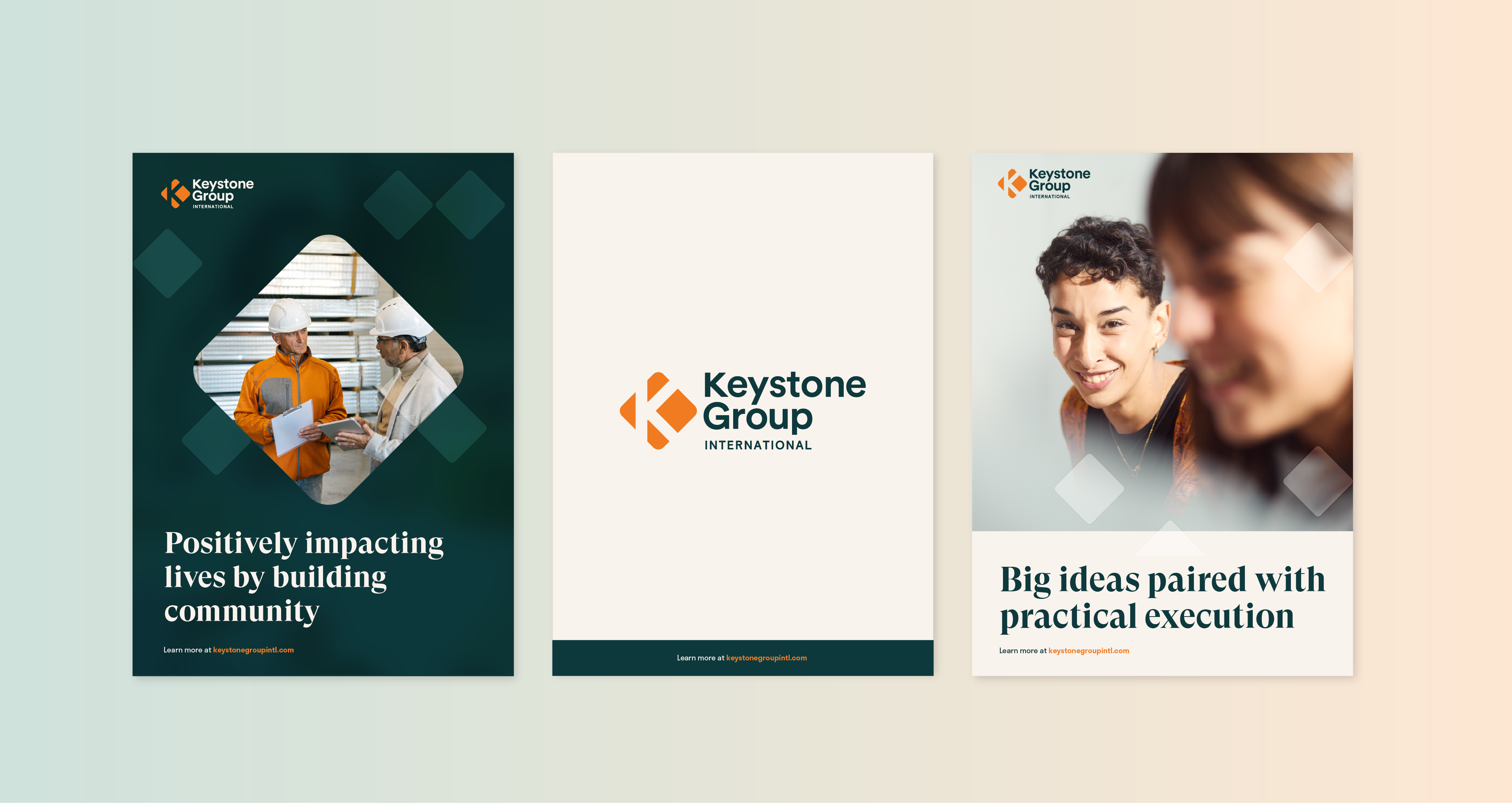
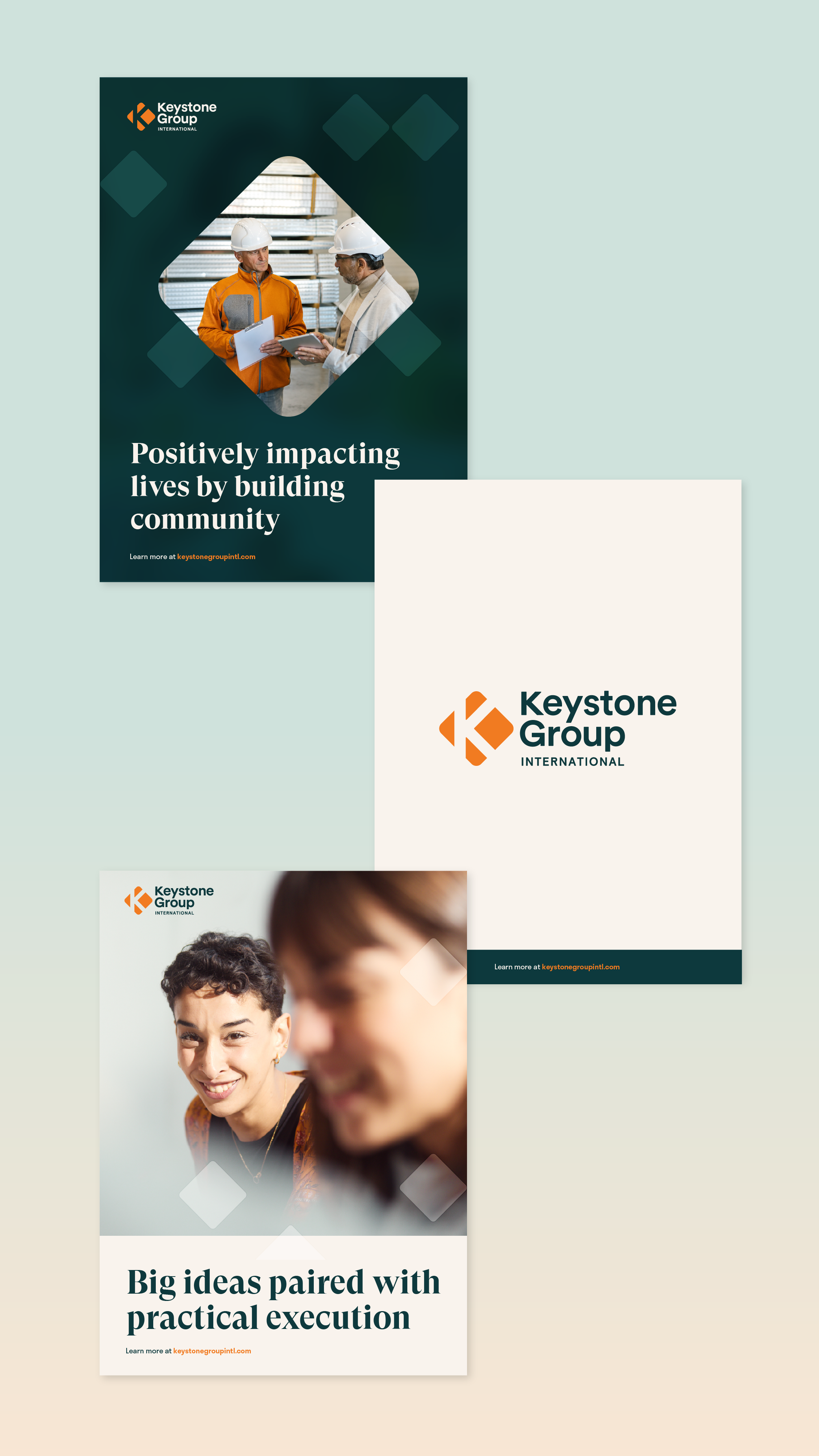
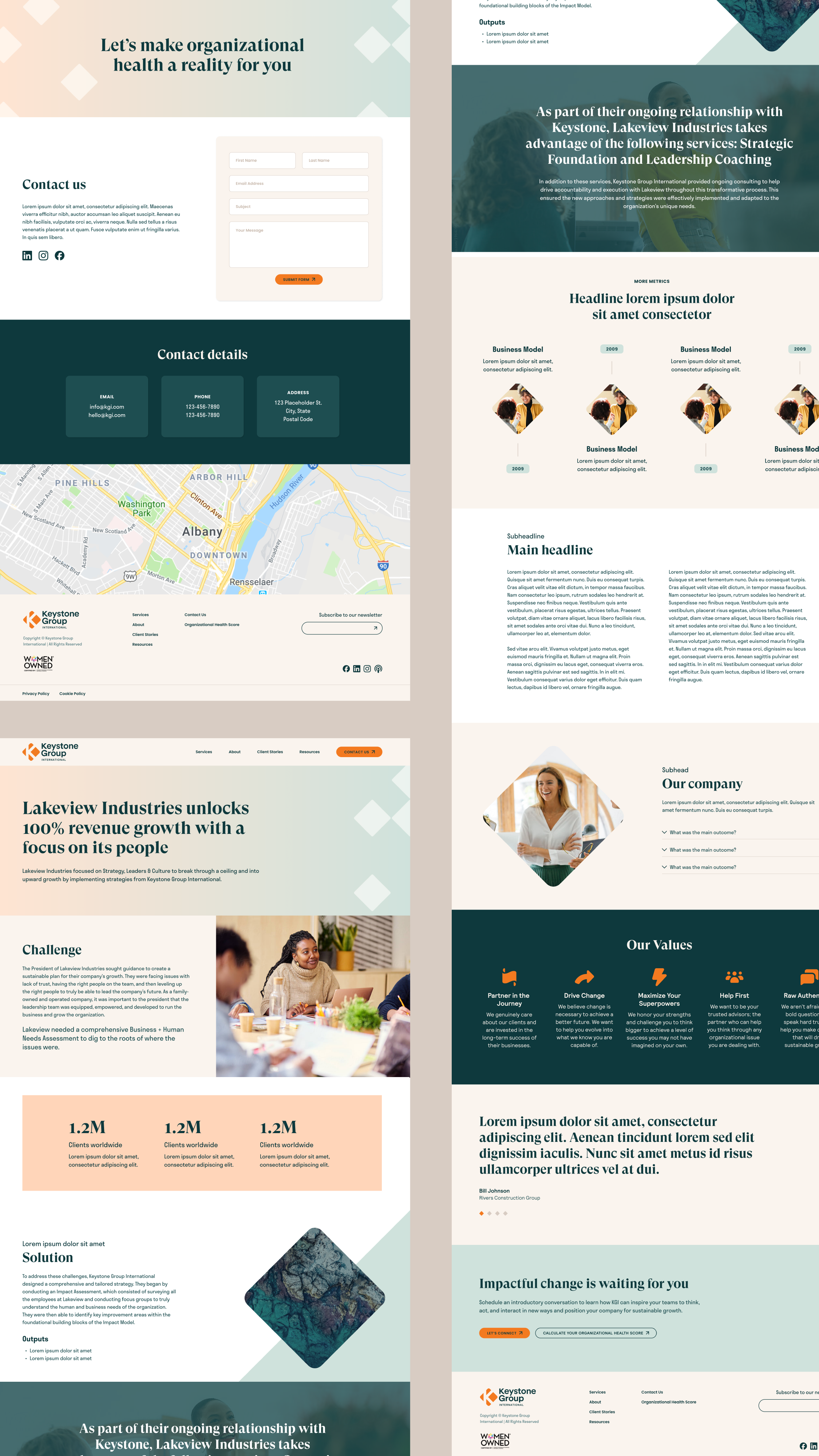
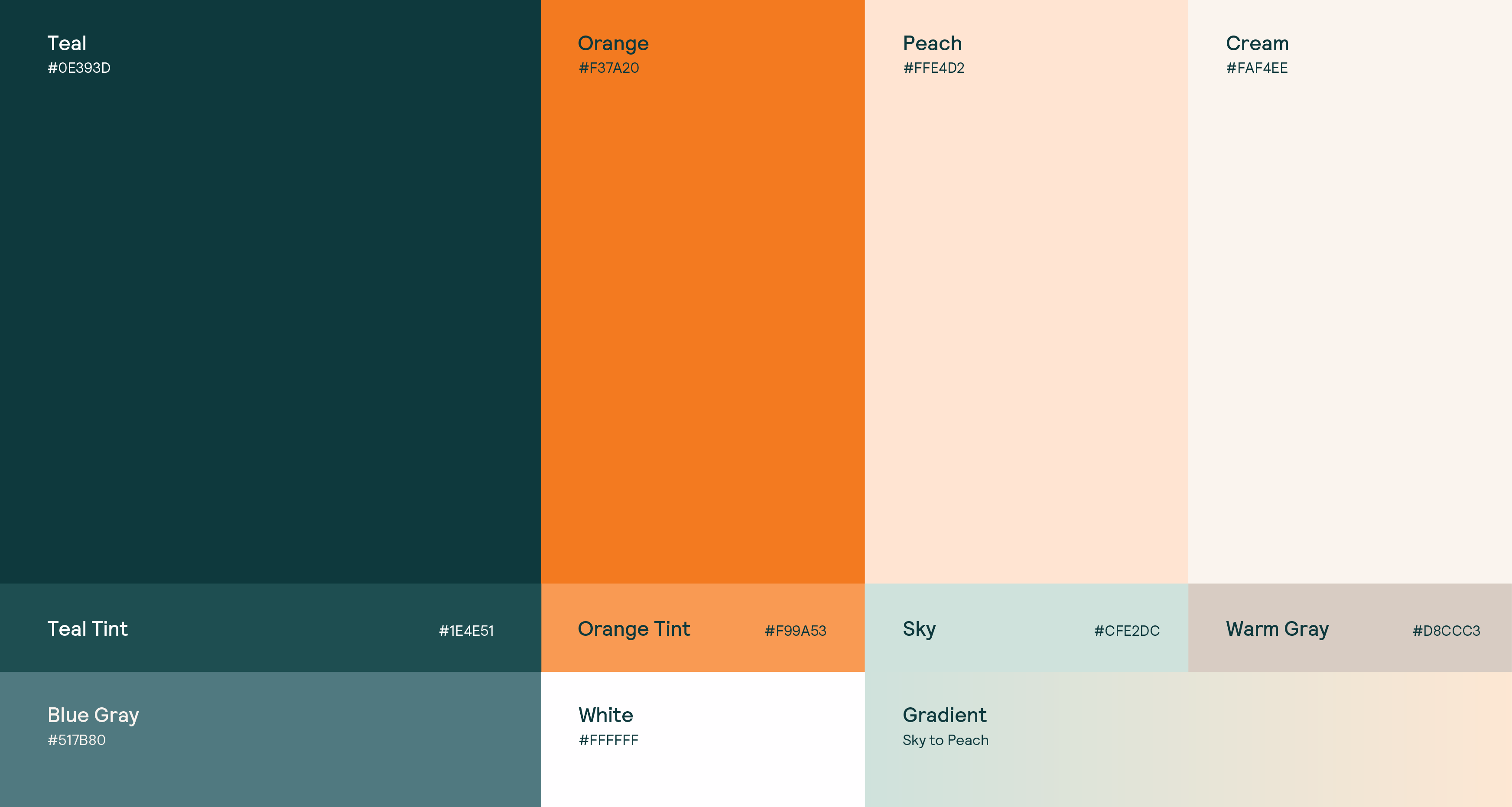
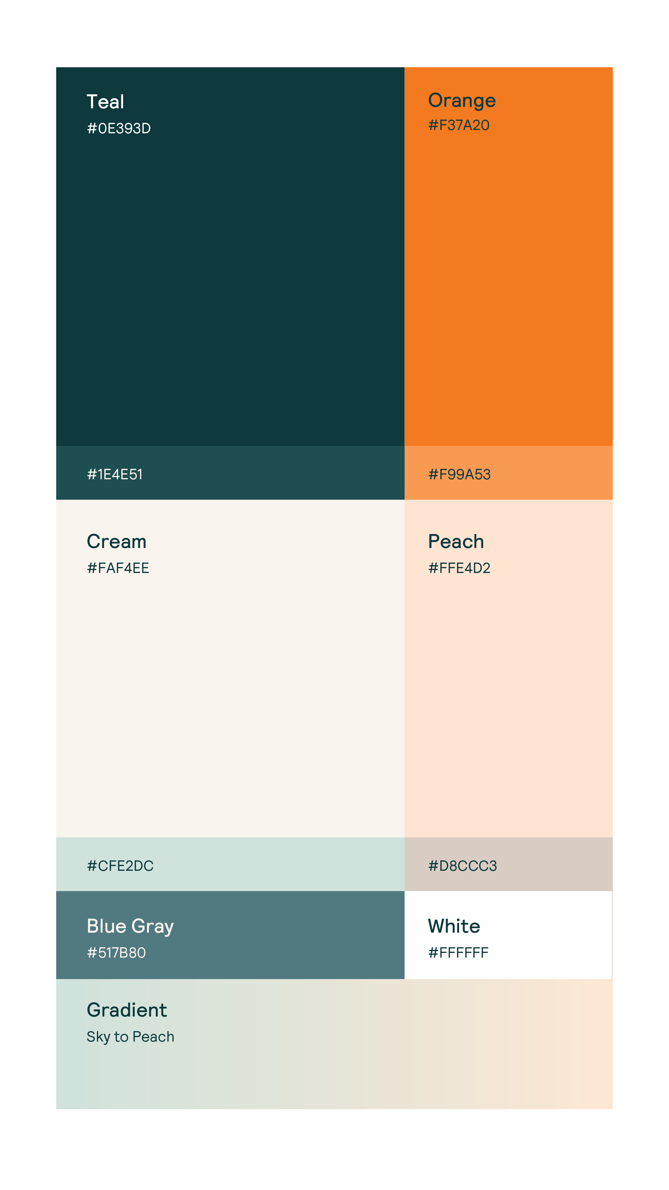
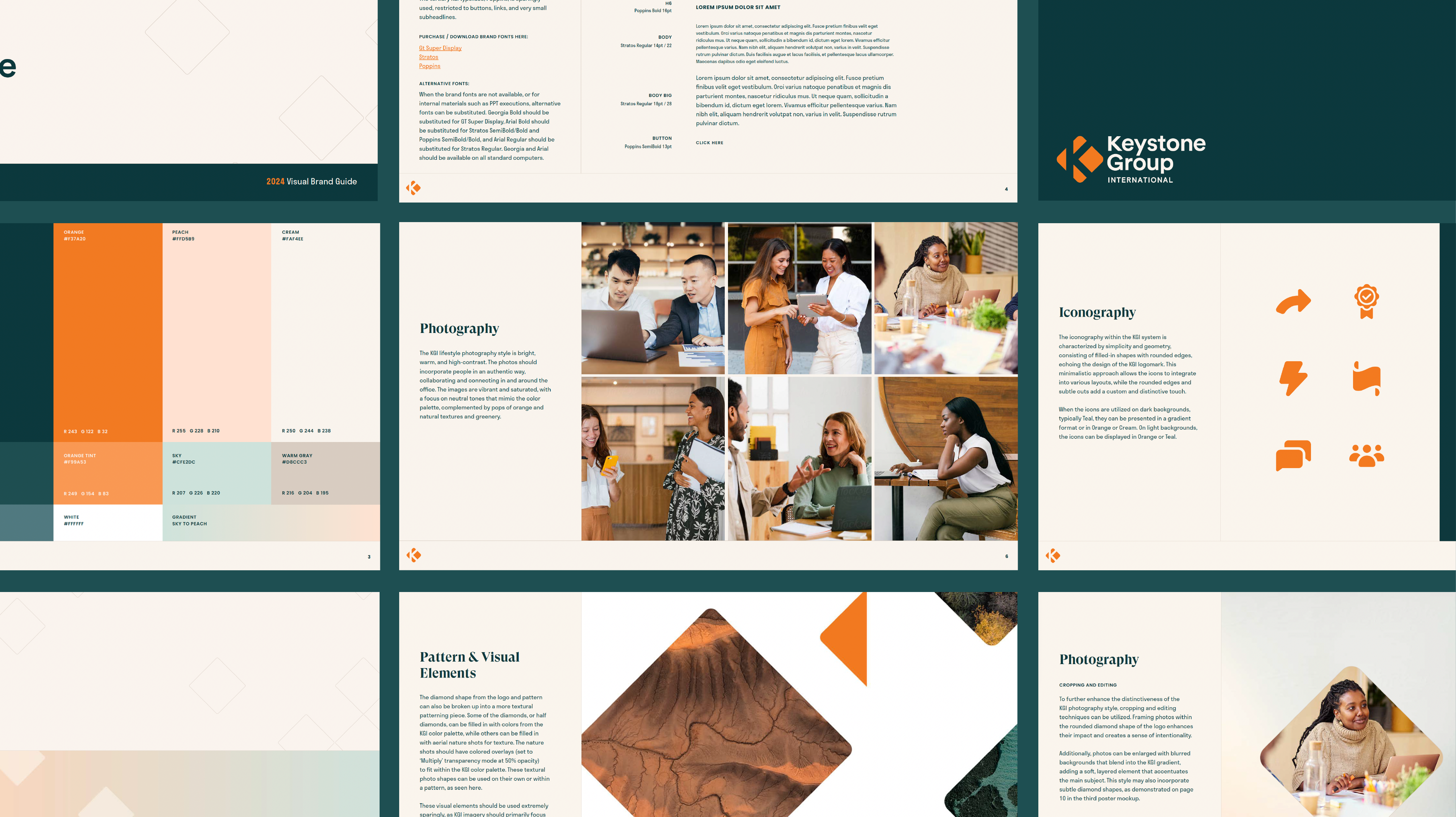
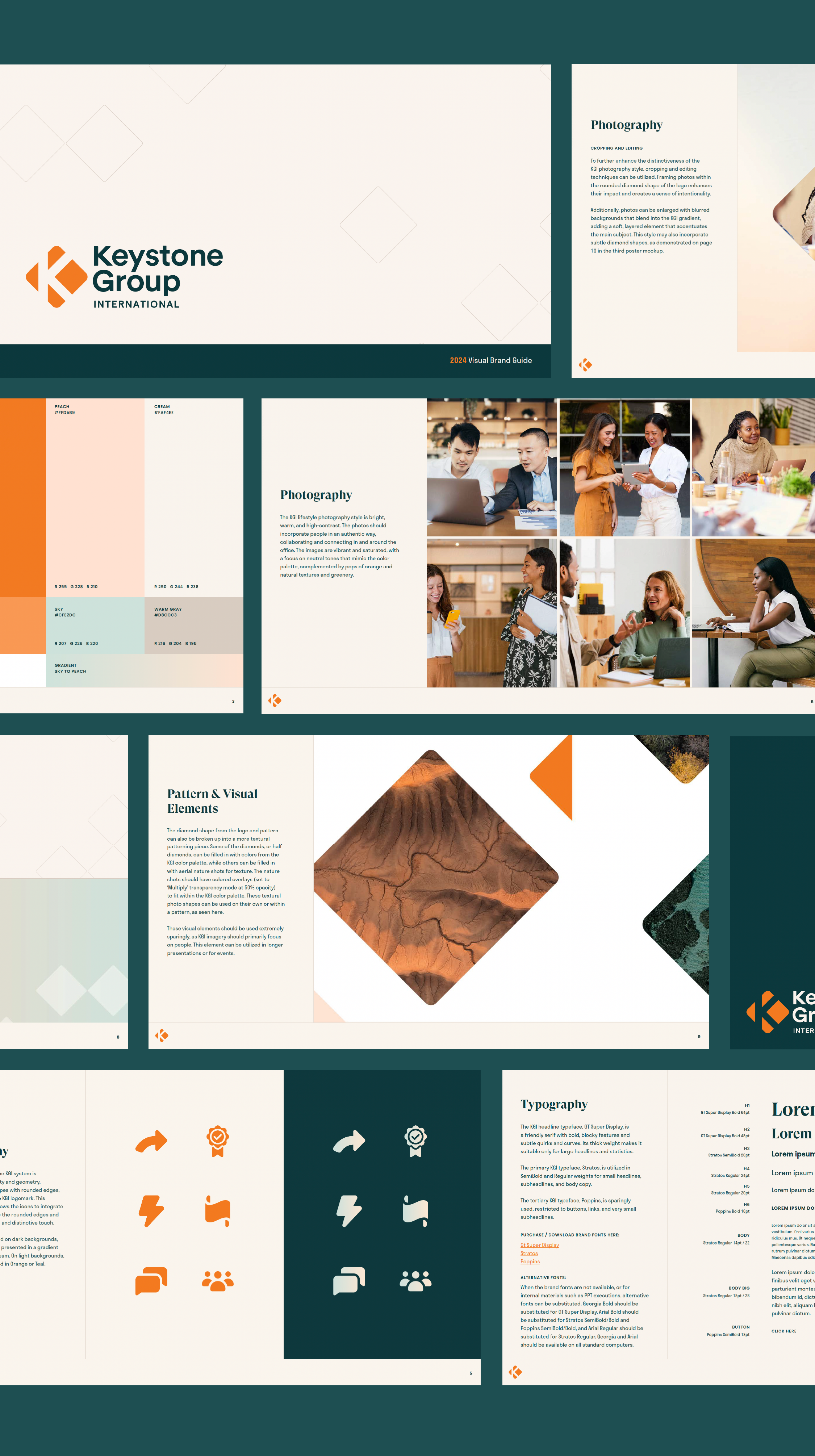
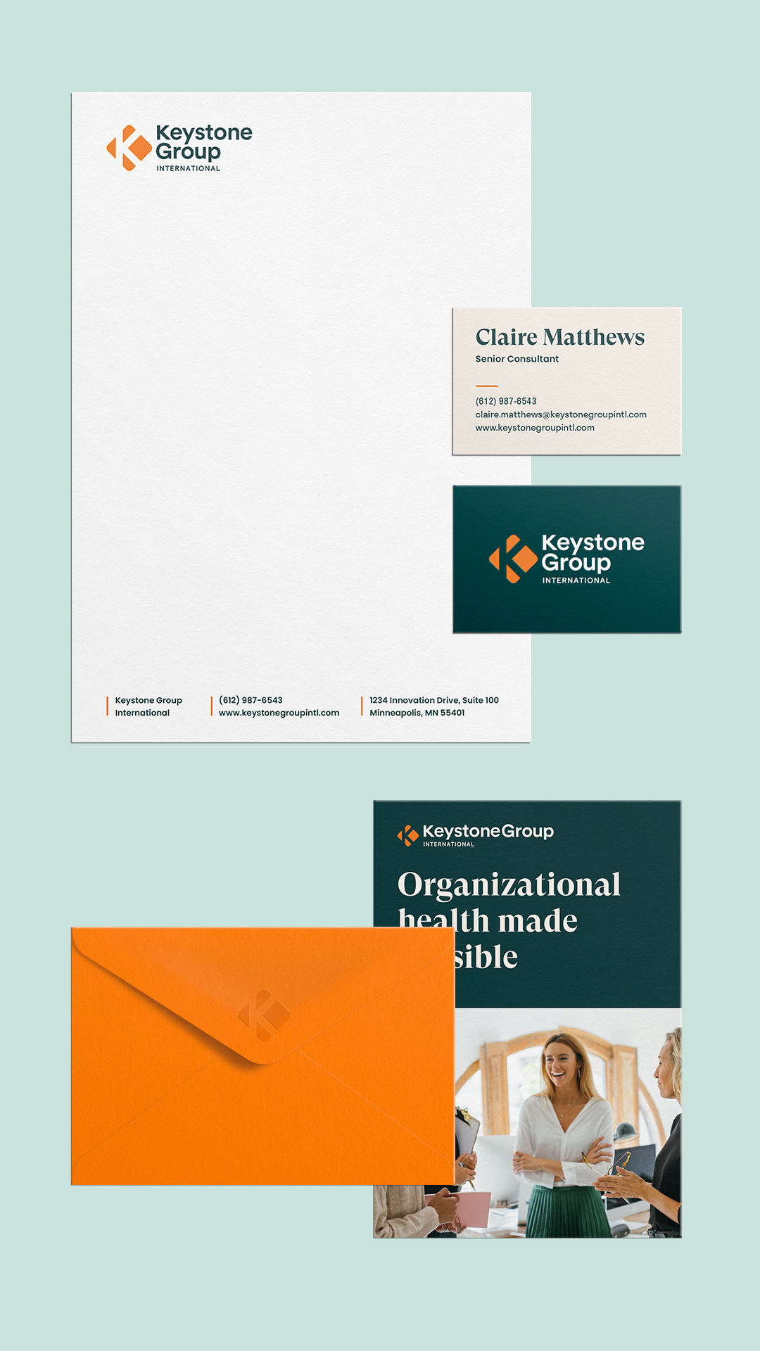
We partnered with Keystone Group International to refresh their brand identity and messaging, aligning it with their modern vision. We brightened their orange and added a friendly teal, creating a fresh palette. By rounding their “K” logomark and using the resulting diamond shapes, we developed a cohesive brand element.

The new photography style was a key element of the brand refresh, featuring bright, crisp, and warm imagery that reflects the updated color palette. The content feels authentic, joyful, and in-the-moment, capturing the vibrancy, confidence, and energy of the Keystone Group team. Additionally, we introduced a textural photography style with color-treated aerial nature imagery, adding flexibility to the brand’s visual language and representing their diverse audiences and journeys.



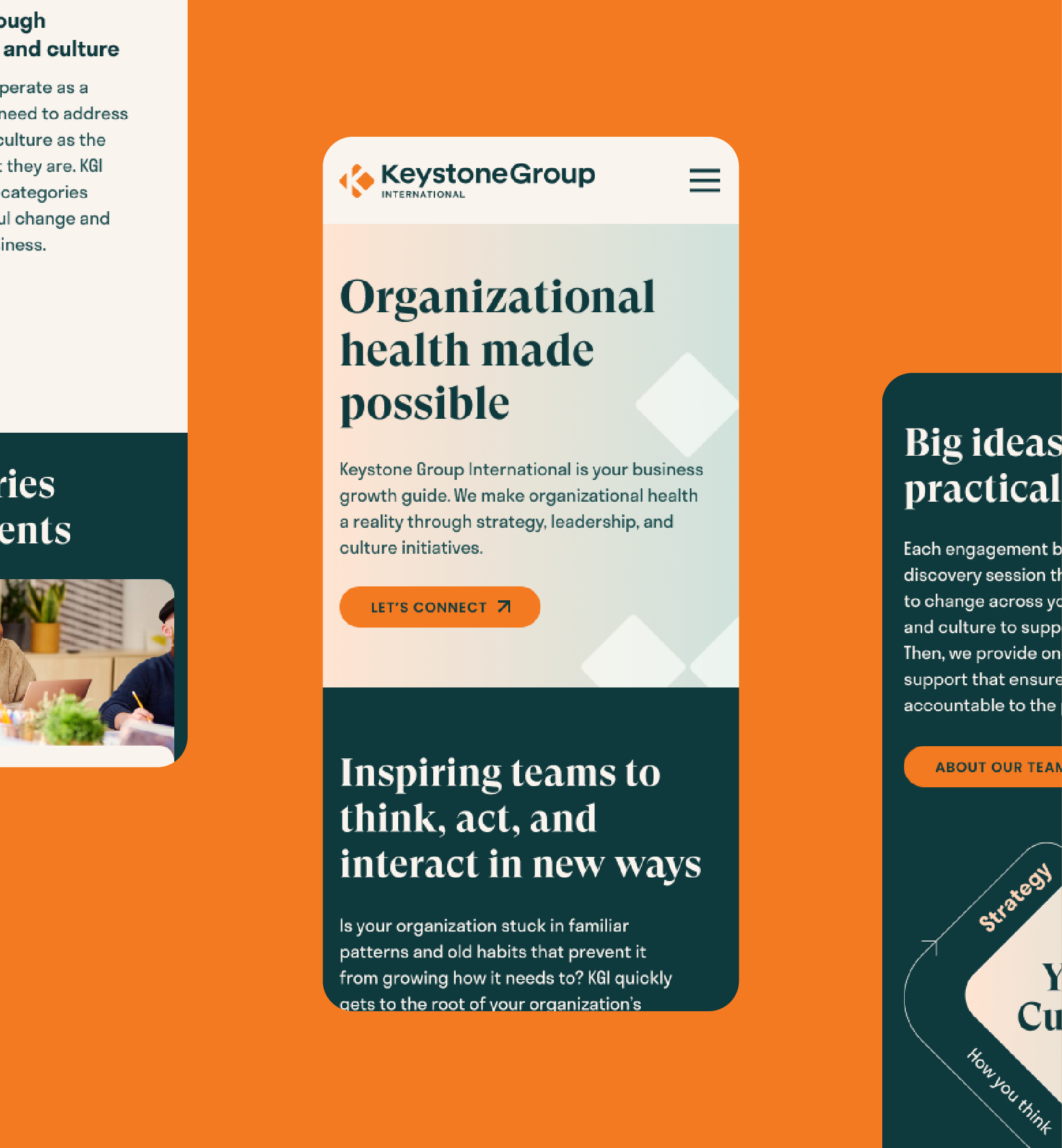
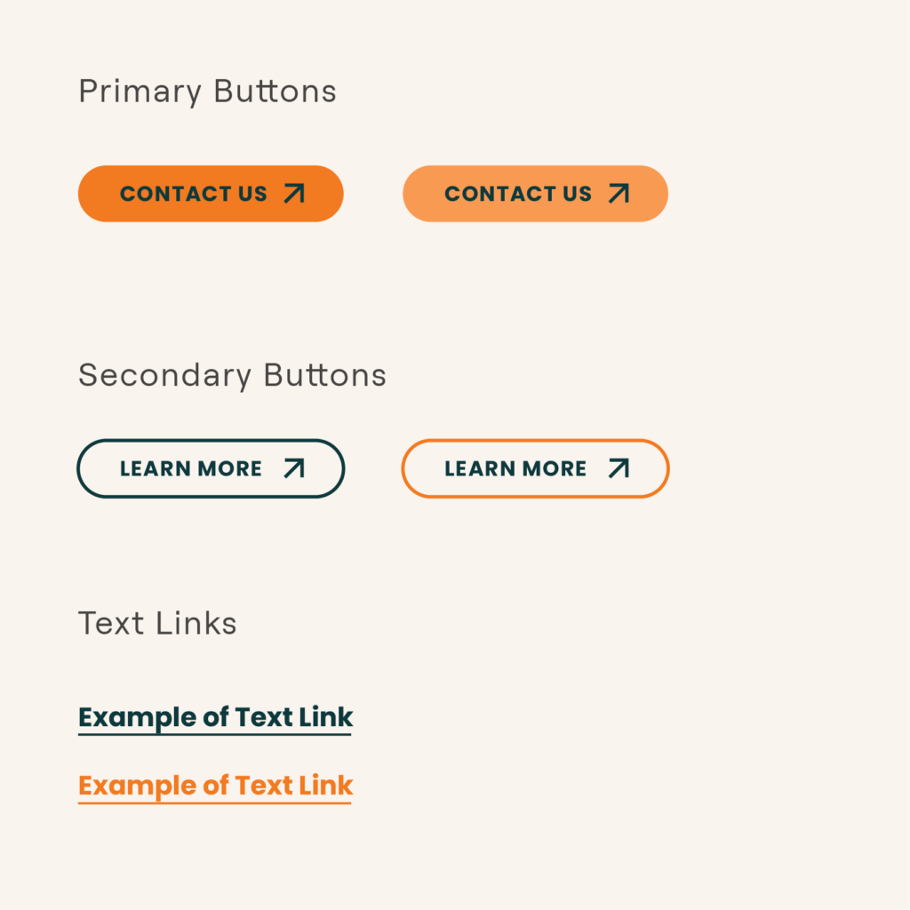
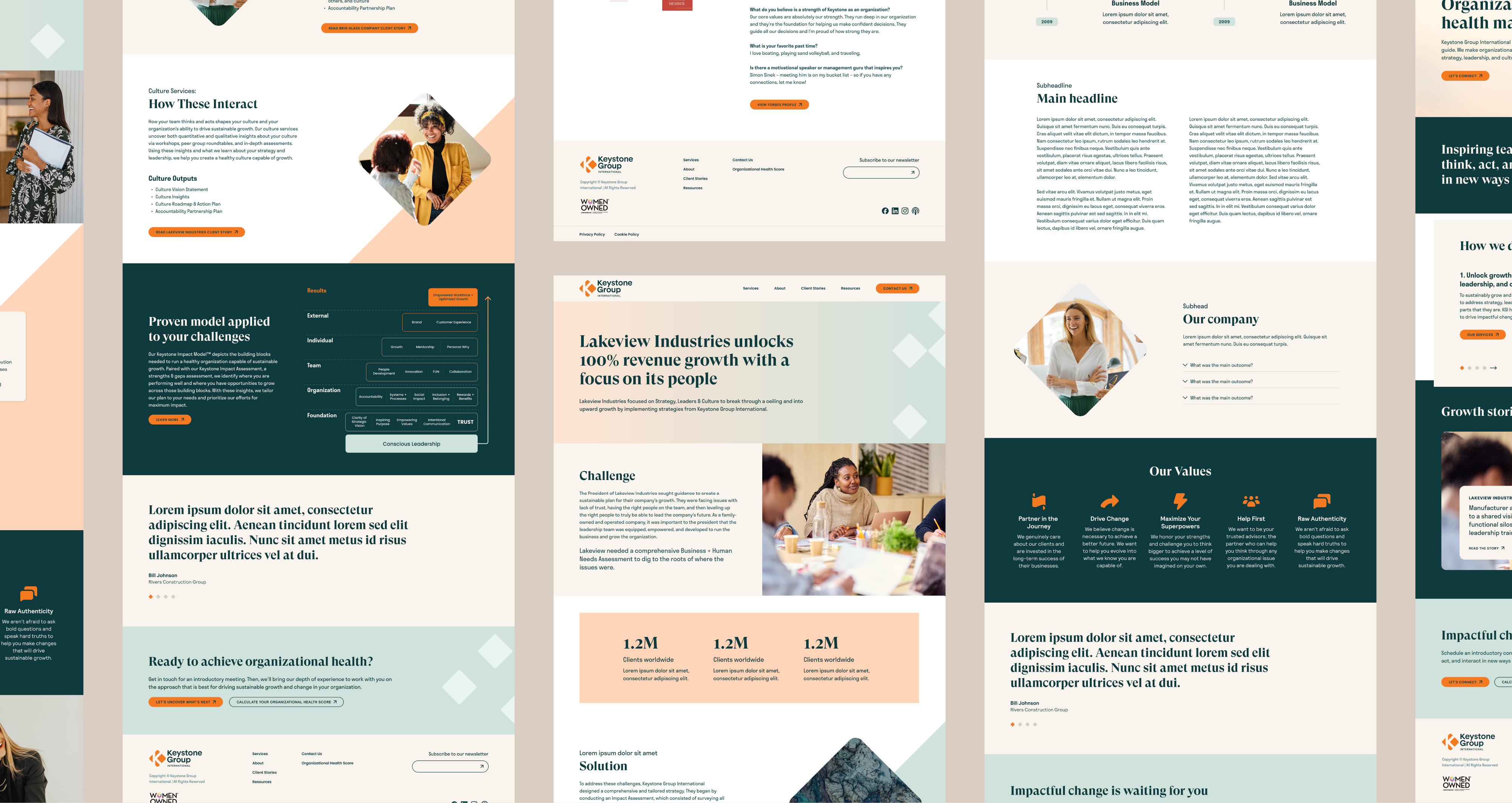
The refreshed messaging and visuals came to life through a new WordPress site, featuring user-friendly UI elements and dynamic layouts that enhance the brand’s story. The rounded corners and diamond shapes add distinctiveness and depth, tying back to the brand logo.
