BankCherokee

- Art Direction
- Brand Identity
- Campaign
- Event Design
- Logo
- Print Collateral
- Website Design
- Website Development
BankCherokee
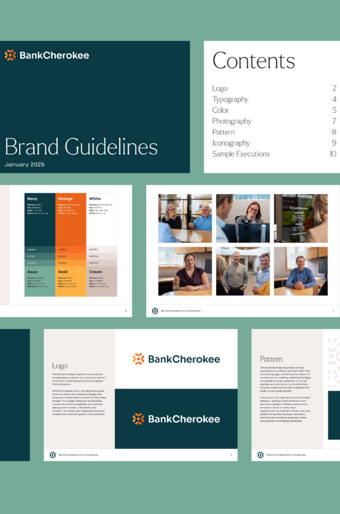
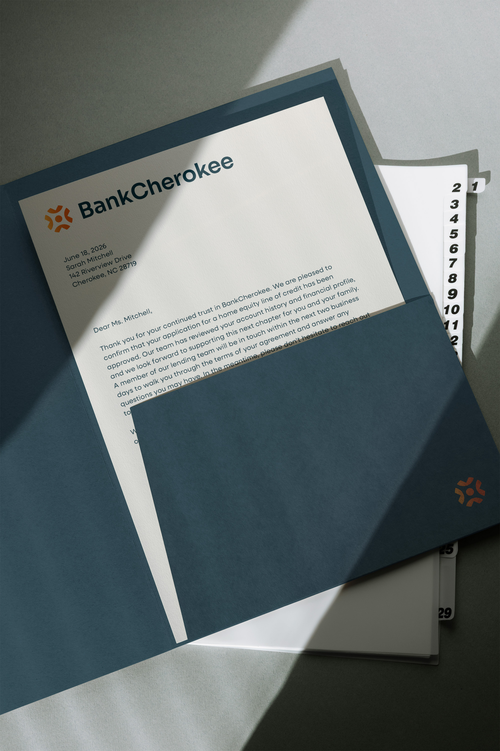
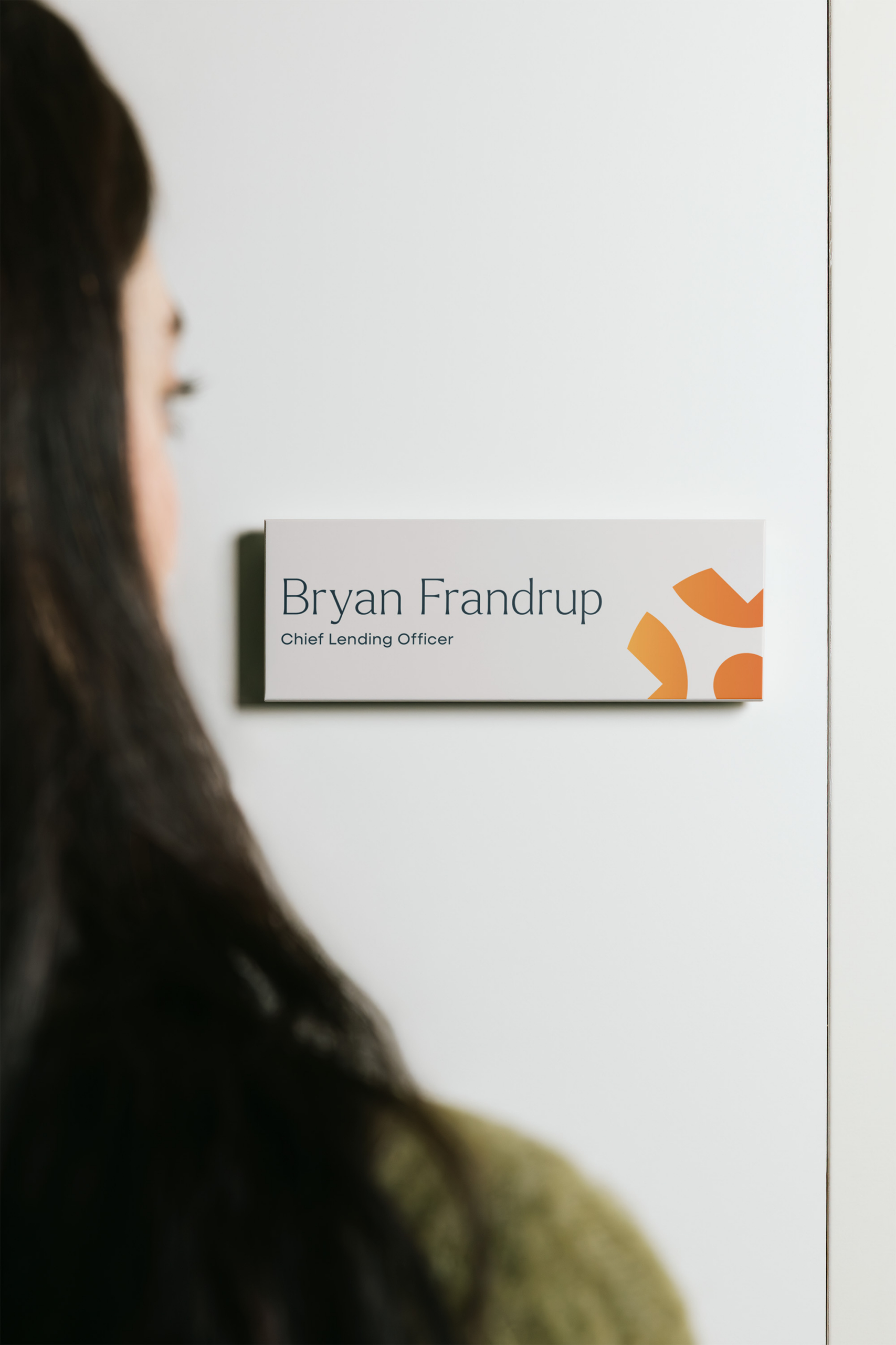
We partnered with Brave Co. on a rebrand for BankCherokee, a long-standing community bank with deep local roots seeking to modernize without compromising the trust it had built over the years. Together, we reimagined the brand from the ground up, balancing small-bank warmth with big-bank capability, and brought it to life through a new visual identity, campaign, and a responsive WordPress website built with accessibility and usability at its core.
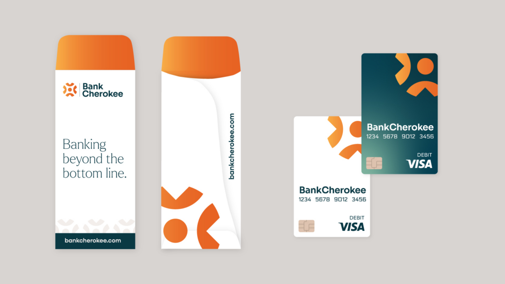
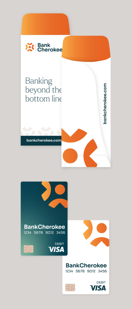
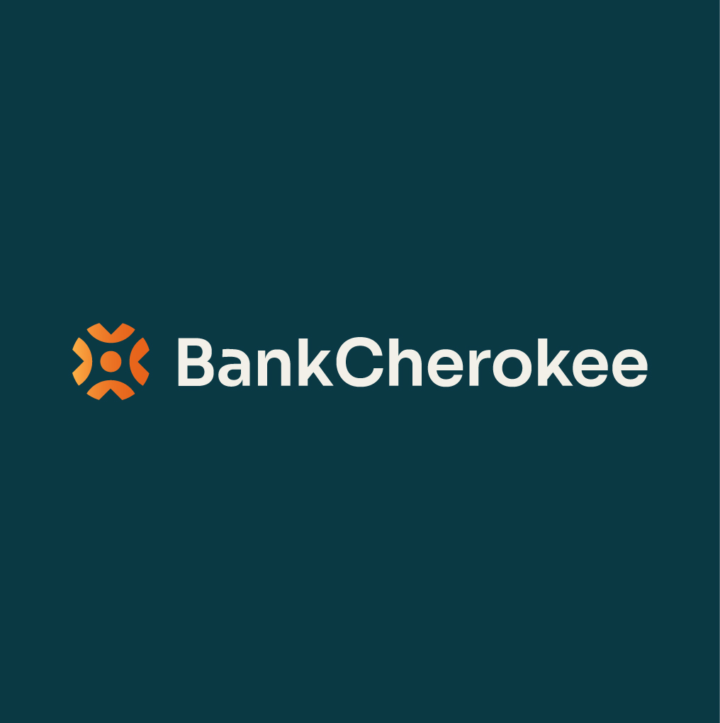
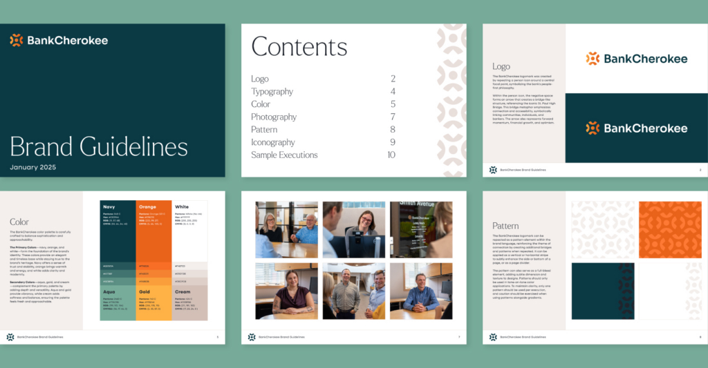
The new BankCherokee mark rotates a stylized figure around a central point, reflecting the bank’s role at the heart of its community and its people-first approach to banking. The surrounding arrows suggest forward momentum while echoing the arched form of the High Bridge, the iconic landmark near the bank’s original location.
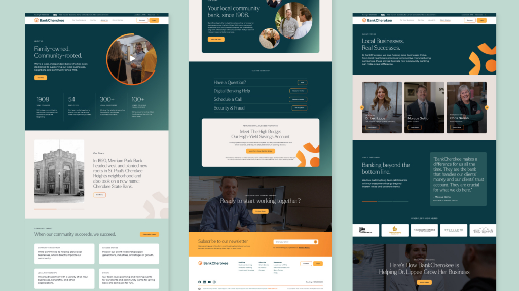
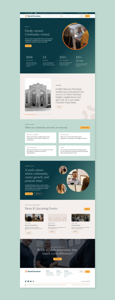
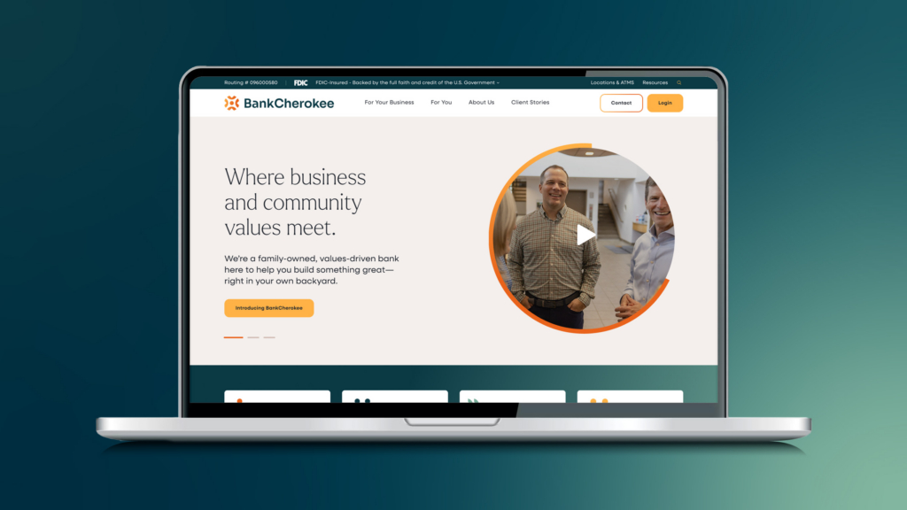
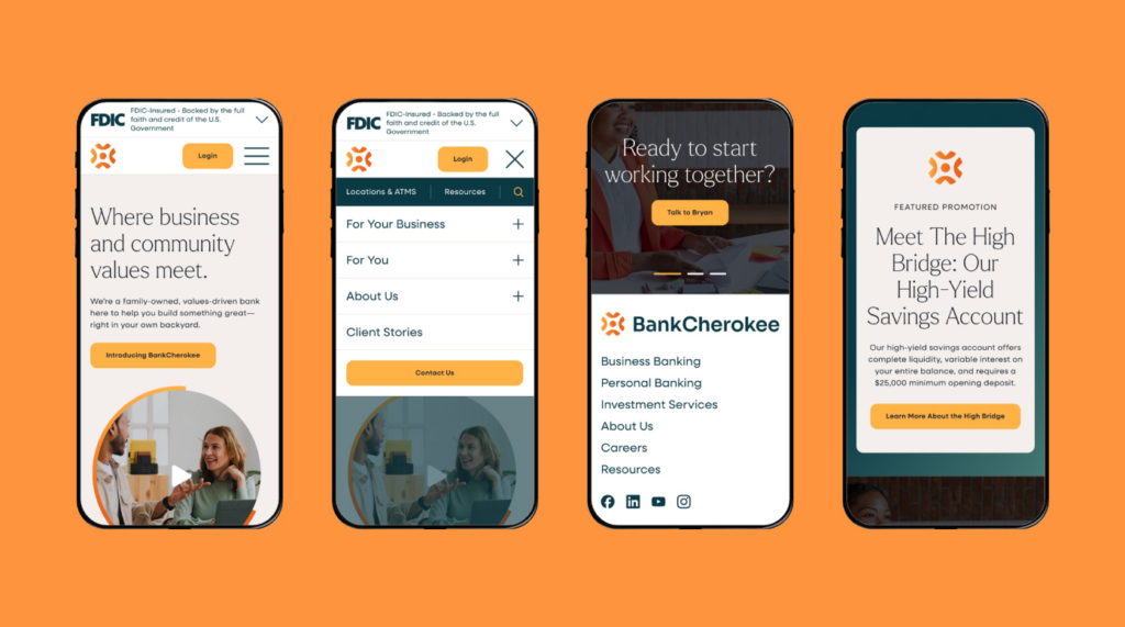
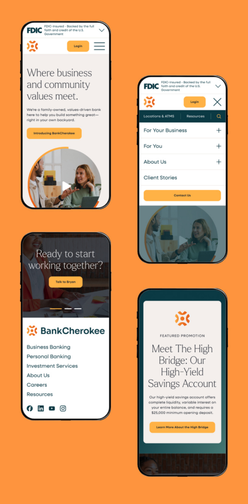
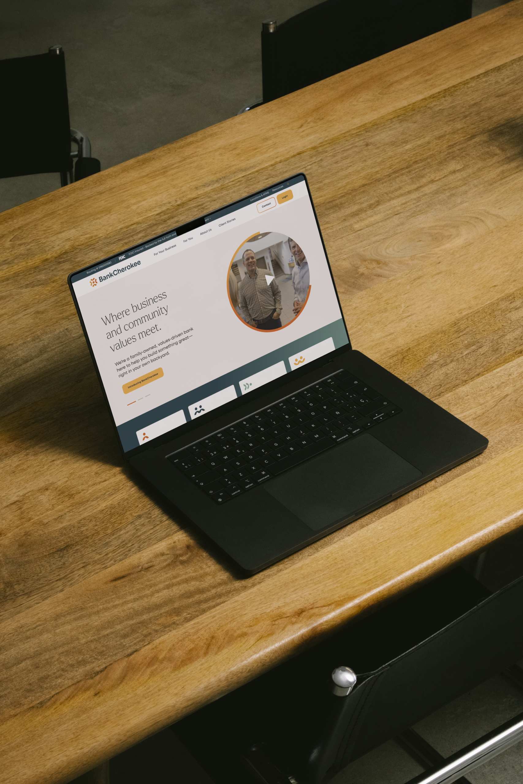
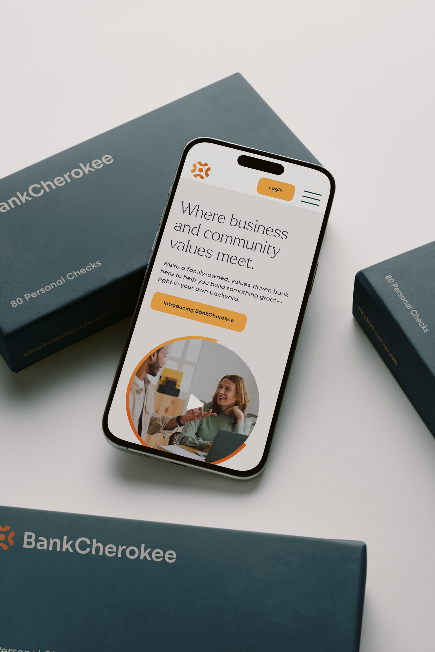
BankCherokee needed a site that felt warm and approachable without sacrificing the trust and credibility of an established bank. We rebuilt it fully responsive, with a new UX and content hierarchy designed for clarity and ease of use. Client stories were placed front and center, reflecting a simple truth: at BankCherokee, people come first.
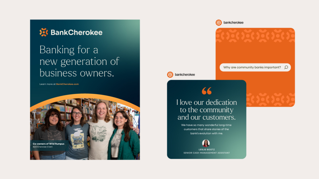
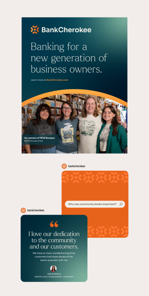
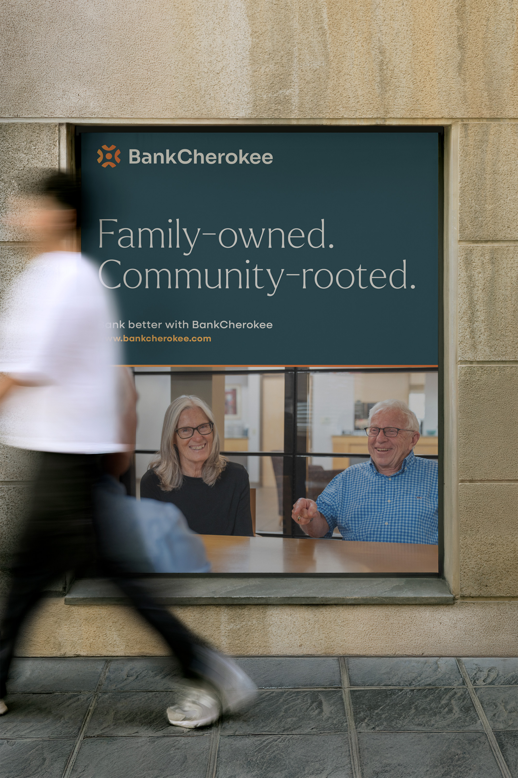
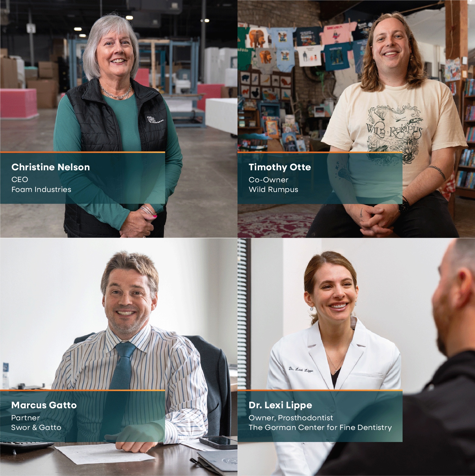
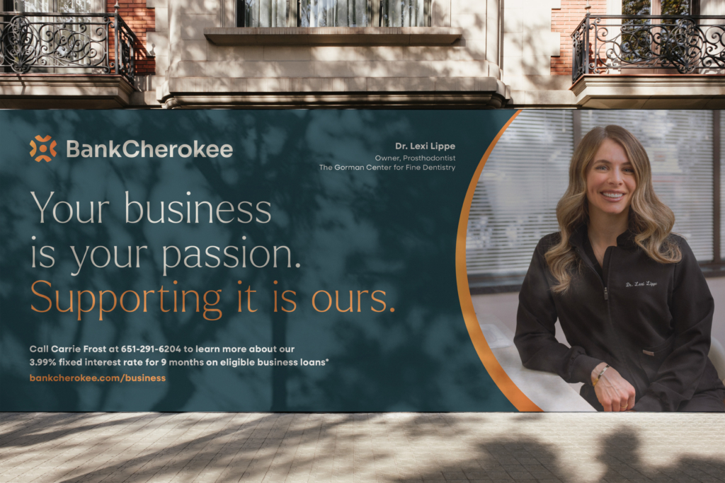
To bring that people-first philosophy to life, we art directed four video and photography shoots capturing real client experiences with the bank. From there, we produced a full suite of campaign assets, telling those stories across every touchpoint and reinforcing BankCherokee’s commitment to the people and businesses it serves.
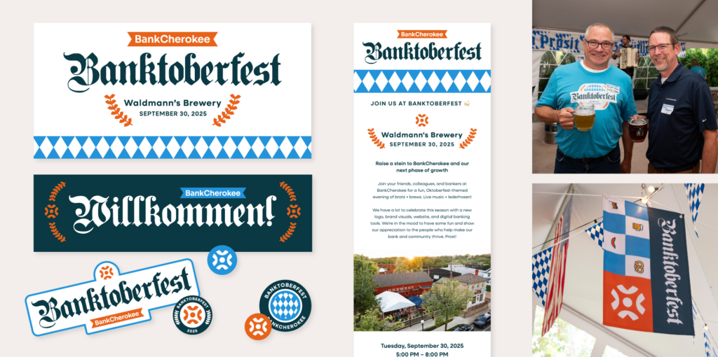
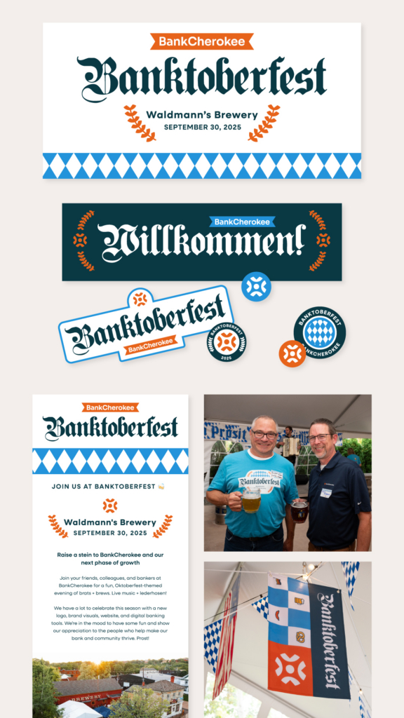
BankCherokee’s brand launch event, Banktoberfest, gave us our first chance to see how the new brand could flex, trading its everyday polish for something more playful and festive. The event became a fun, low-stakes proving ground for the brand’s range, all while keeping its warmth and personality intact.